Been a couple of weeks since I did one of these.
This is a dairy brand specifically for men. Interesting positioning. I like the name and associated mammoth icon and the use of large typeface. Effective.
via dieline
Another New Zealand brand with a strong use of colour combined with a repeat of the large typeface and a hint of a handwritten font for the variety name. This would stand out on the shelf and it works for me.
via dieline
Frisk Yogurt by Mats Ottdal
This appears to be a concept design from 2008 – this is a yogurt designed for kids and it is very appealing
via LovelyPackaging
Yes please – they used a 100 year old press to get an authentic feeling of integrity for these.
via dieline
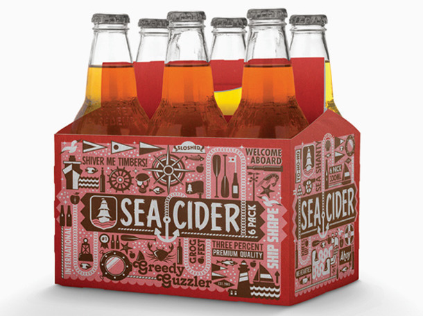
Sea Cider by I Love Dust
This very busy carry pack manages to strongly evoke a seaside feeling. Nice.
via fffound
That’s it for this post – loads in the backlog so must get to the next one in the series a bit quicker next time.
Keith


Nice blog man. This blog is a celebration of local, small scale and artisan food producers who truly care about the food products they produce.it will help for the costumer.