A perspective on Outstanding by Design from Dave Donohue


Dave is a Thomastown based writer working on his own craft beer product & when I saw that he was coming to the event I asked him to pen his thoughts on it. Here they are.

Keith

David Donohue – guest blog for Bia Beag

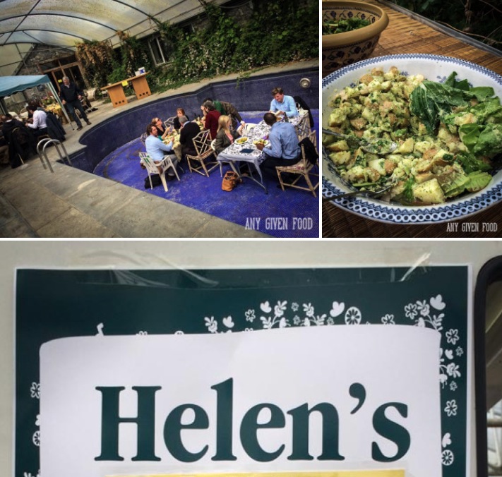
When I attended Bia Beag’s Outstanding by Design forum at Highbank Orchards in June, I did so as part of my research for a craft beer which I am currently developing.

Although aware that branding was essentially about communicating to the potential customer ‘what you are’ as a brand, I didn’t necessarily see the investment of money in the branding process as an essential part of launching a new small-producer product.

As somebody who works with a well-stocked little Kilkenny deli (Glasrai & Goodies), on the marketing and sourcing side, I come across a lot of small-producer food and drink products which have been launched without engagement with professional designer/consultants.

..all rely on simple packaging/labelling


Products like Sally Barnes’ Woodcock Smokery’s smoked fish, Goatsbridge’s trout (before its recent ‘branding’), Highbank Orchard’s Driver’s Cider, Orchard Syrup and ciders, Danette Milne’s pesto’s and sauces all rely on simple packaging/labelling.

When I see these products beside the ‘branded’ ones like Paddy O’s Granola, Mella’s Fudge, Mic’s chilli and Gubbeen cheese I don’t necessarily see the branded products jumping off the shelf in comparison.

Siobhan Lawlor, who owns Glasrai & Goodies, always says that the most simply packaged produce does best in her deli. In Siobhan’s opinion anything too fussy, loud, showy or glitzy puts the customer off buying artisan produce. ‘Truffle Fairy truffles come in a plain box with just a tiny sticker with the Truffle Fairy logo. There is no contents information, and yet we can’t keep them in stock.’

Before the Outstanding by Design forum I intended to design my own label for my craft beer, named after Ireland’s most famous philosopher, Berkeley, with the help of a brilliant local artist/illustrator. I was going to do something that looked good, stood out on the shelves and got the story across. If my product did okay in the market I would then look at ‘branding’ to take it to the next level.

…the length and intensity of the branding process

I was interested to me if the forum would sway me from my intended approach. The first thing that struck me as the forum progressed was the length and intensity of the branding process.

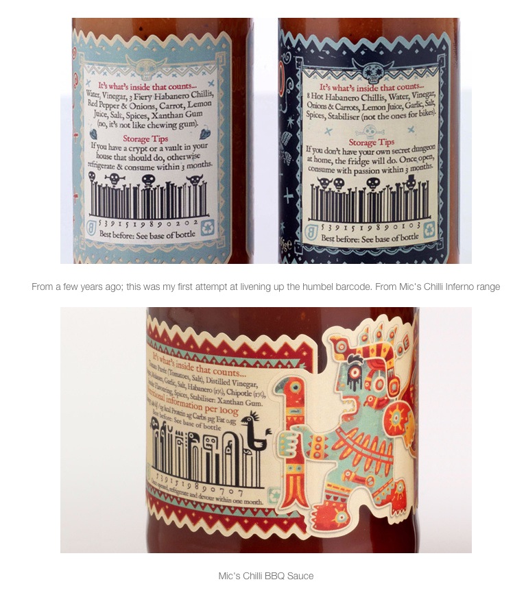
Sarah Maguire from Brand Union spent months delving into the branding possibilities afforded by Paddy O’ Connell’s love of the great outdoors, good looks and strong personal story, while the evolution of freelance designer, Steve Simpson’s label designs for Mic Wejchert’s, Mic’s Chilli, incorporating the bar code into his ‘day of the dead’ influenced cartoon-like illustrations, was an eye opener.

As well as being a window into Steve’s artistic approach, the conversation highlighted the lengthy step-by-step process that created a clearly-branded, quirky and memorable product, while fulfilling the producers exacting brief. Steve also brought to light how some freelance designers are willing to be flexible, price-wise, when working with new producers with whom they hope to develop a long term relationship.

…highlighted by the forum was its collaborative nature


Another aspect of the branding process which was highlighted by the forum was its collaborative nature. Mella Mc Auley, from Mella’s fudge and freelance designer, Liz Maybury seemed to delight in the process of working together, with Liz emphasizing how she faithfully incorporated Mella’s one stipulation, that gold foil be used for the lettering of the fudge bar packaging.

Erik Johansson, from The Green Man Studio and Paul O’ Connor of the Trouble Brewing, brewing company also gave a great insight into the to-and-fro between designer and client. In this case the brief was to re-brand a craft brewing company with a stipulation to be ‘rebellious yet not offensive.’ This re-branding has, according to Paul, been a huge factor in Trouble Brewing’s year-on-year growth of 50%.

Christina Moody from Value Added in Africa and Laura Macauley from Navigate by Design illustrated how inspired re-branding gave a small African Community-focused honey-making project a real shot at the International market.

Rachel Kerr from Creative Inc & Liz Skehan (mother of Donal) of Skoff pies talked about Liz and Donal’s newly launched product, and the design brief, which asked her to emphasise that Skoff Pies ‘stand for home cooked food with a funky personality.’ Rachel emphasised the importance of a good name in being identified, recognised and understood, and the role which colour plays in branding.

His advice to me was simple – have a clear idea of what your product is…


After lunch the attendees were given the opportunity to have a one-to-one discussion with a designer of their choice. I chose Eric Johanssen, who had created Trouble Brewing’s entertaining and eye-catching labels. His advice to me was simple – have a clear idea of what your product is, who the customer is, and why they might want to buy it, and to use this information to create a brand image that sets your product apart.

He liked my product idea and especially the products unique twist (I should be in marketing!). He also loved my choice of label illustrator because, Eric said, my designer is a guy with a very individual style, and a great love for craft beer. The Eric gave me his card and told me to call him as the project came closer to fruition.

The concluding talk of the day, following designer Lorenzo Tonti and Gubbeen’s Fingal Ferguson’s warm-hearted discussion about the Ferguson families long relationship with the designer, came from designer, Giles Calver.

Gile’s wrote the book ‘What Is Packaging Design?’ which organiser/host and the man behind Biabeag, Keith Bohanna, had earlier suggested was the product-design bible. Giles bullet-pointed the essentials of good branding, summarising the key points of the day in the process.

…good branding is not just an essential for product success, but a fascinating world in itself


Giles left me with a sense that good branding is not just an essential for product success, but a fascinating world in itself, a world which combines psychology and anthropology, while being ruled by with the basic tenet that humans like nice things in nice packages.

Almost two months on from the Outstanding by Design forum I continue with my product research. I see beer labels that have been through months of design consultancy at great cost and some which have been put together by the brewers teenage art-loving daughter on photo-shop, and I can’t always tell the difference.

…I’m still not convinced that I need to hire a professional designer


So, no, I’m still not convinced that I need to hire a professional designer to take my beer to the shelf, at least initially. Goatsbridge trout thrived and grew for years with their initial packaging, and Highbank Orchards, with a simple label designed by Julie Calder-Potts, can barely keep up with the demand for their Driver’s Cider.

I do know, however, that everything I learnt during the forum will inform my approach to designing the label for my unique beer product, and, if I’m not happy with the results, I just might give Eric Johanssen a call…

David Donohue David Donohue is an author/songwriter/horse racing journalist with a love of food and craft beer. David works as marketing consultant, Facebook manager, with Glasrai & Goodies and the Truffle Fairy Café and Chocolaterie. davyd@eircom.net

Full versions of the presentations given during Outstanding By Design

There are no excuses for being this late getting these up onto Slideshare, apologies.

Every presentation given during the day (with the exception of the one done by Brand Union on their work with Paddy O’Granola which they asked me not to share) is now up and included below. Links to the videos of the presentations where they have been put up by Ken McGuire are also included.

Sarah Maguire, Brand Union & Paddy O’Connell, Paddy O’Granola

 Laura Macaulay, Navigate By Design & Ka Tutandike

Erik Johansson, The Green Man Studio & Paul O Connor, Trouble Brewing

Liz Maybury & Mella McAuley, Mella Fudge

Steve Simpson & Mic Wejchert, Mic’s Chilli

Rachel Kerr, Creative Inc & Liz Skehan, Skoff

Lorenzo Tonti & Fingal Ferguson, Gubeen

Giles Calver, Thoughts On Food Packaging

Hope you enjoy those, as further videos are put up by Ken I will include them here. My thanks again to each of the designers and producers who came along and shared their learnings.

Keith

Outstanding By Design – Photos, Videos and Audio @anygivenfood

In the world of well resourced events everyone has a media partner – usually one of the national newspapers or a national radio station. I have/had my good mate Ken McGuire who wears his AnyGivenFood hat for such stuff.

On 12th May he took photos – sample underneath and full post here.

Screenshot 2014-05-18 16.31.58 Screenshot 2014-05-18 16.32.35 Screenshot 2014-05-18 16.32.44

He shot video and is slowly splitting out the audio tracks so that you can listen to the full day on podcasts.

First one of Sarah and Paddy can be listened to at this link here.  The second with Giles Calver is on this link here.  The full AnyGivenFood podcast series covering Biabeag and a lot more can be subscribed via the links in his post here.

Finally the videos are being put up on Youtube and the first two are embedded below.

I’ll post further videos as they are edited and uploaded – thanks Ken 🙂

Keith

Illustrated barcodes? @stevesimpson explains these and more at Outstanding By Design

You know when a designer gets full reign to do whatever their imagination dictates. That must have been what the relationship between Steve Simpson and Mic Wejchert of Mic’s Chilli must have been like. Can’t wait to hear the pair of them at Outstanding By Design.

These screenshots taken from Steve’s Dropr page.

Screenshot 2014-05-04 14.57.11 Screenshot 2014-05-04 14.57.00

More details and a booking link for the day (next Saturday 10th May) here.

Keith

Outstanding By Design – why are attendees booking?

Couple of blog posts between now and next Saturday’s Outstanding By Design featuring people and businesses who will be there on the day. So you get a sense of what is driving them.

Conor Mulhall, General Manager, The Little Milk Company

“Irish Organic Dairy producer The Little Milk Company confirmed that they were the winner of the Best Organic Cheese award at the 2013 British Cheese awards. The results of the 20th British Cheese Awards were announced on Friday night in a big top marquee on a quintessentially English village green in the heart of Cotswolds. During the Summer months they also won a silver for their newest cheese the Organic Caerphilly and they won a Bronze and the prestigious Gold award for their Organic Mild Cheddar, Croagh Patrick.

According to the Little Milk Company General Manager Conor Mulhall they were thrilled, “We entered the Irish awards back in June and won four awards and then to come to the International awards in our first year and win 4 awards including the Gold is just amazing. It is a testament to the quality of our farms, our milk and all the hard work our farmers and excellent cheese makers have put in to get the cheese right.” The cheese is now available through Paxton and Whitfield as the Guest Cheese for September, and many others. It is also available online at their website www.thelittlemilkcompany.ie. The company are also in discussion with several other retailers with a view to getting the product available nationwide over the coming weeks.

Croagh Patrick Mild Organic Cheddar is made with the farmers own 100% certified Irish organic milk. This is made made using pasteurised milk. It is made using a traditional recipe and the cheese is then hand-wrapped in cheesecloth and hand turned in their maturing rooms. The cheese has a creamy taste, with a subtle and long lasting flavor. Other cheeses The Little Milk Company produce include: Mount Brandon Caerphilly (2 months old), Sliabh na mBan mature (aged from 9-14 months) and Sliabh na mBan vintage (aged from 14 months up). They are all high in anti-oxidants and rich in omega 3. The mature and vintage are made from raw milk. They has been very well received at tastings and they the company have received orders from France Germany, the UK and Dubai.”

Edmund Hart, Marketing Manager, GoatsBridge Trout Farm

“We have recently re-launched our shop and as part of an incentive we are looking to roll out our ‘fish Friday’ promotion where customers who come to our shop on Fridays can avail of special promotions. We are also actively looking to hold smoking workshops and cookery demonstrations throughout the year, anyone interested in booking these or simply coming down to the farm for a tour should go to www.goatsbridgetrout.ie for more info.”

Screenshot 2014-05-04 12.27.12

Helen Meade, Marketing Manager, Killowen Farm

Here at Killowen Farm yogurt we find packaging is an area of great complexity. We make everything from 125g pots right up to 10 Litre buckets for hotel and catering and we also do a greek-style yogurt range in glass jars. I suppose up until now we have been working on a “needs must” basis and figuring out our packaging on our own. This has led to a rather fragmented looking range with some labels are multi-tasking a bit too much over a wide variety of packs.
We also need to look at ingredients and labelling from a legislative perspective as there are new EU directives around this area.
We also want to tell the story of the farm and show the quality of the product better.
With all this in mind we are now looking to improve our packaging portfolio and the workshop is an excellent opportunity to get an idea of how the agency/client relationship works. It’s really good timing for us.
Our-Team-DSCF9056 Screenshot 2014-05-04 12.29.36

Paul Broderick, General Manager, Pembroke Hotel

Its not just food producers! ” I have fairly good working knowledge of branding but currently in the process of tendering for the right designer to take our branding project to the next level. After making some wrong choices in the past, I want to ensure that I have the knowledge to write an effective brief to ensure we choose the right person for the Kilkenny Pembroke Hotel.”
Screenshot 2014-05-04 12.34.39
Look forward to meeting all of those and many more on Saturday 10th at Outstanding By Design – bringing food branding and packaging design to life 🙂
Keith

Outstanding By Design – @lizmaybury and the story of the @MellasFudge packaging design

Cheating here, this is a guest post done for me by Liz in 2011 (5th May, almost 3 years ago!) and bringing it up the blog because Liz and Mella are one of the pairings in Outstanding By Design on 10th May. She may not like me for not updating her photo 🙂

Elizabeth Maybury who shares the story of the Mella Fudge packaging design including some practical stuff on her experience of finding printers for the work. I first saw Mella Fudge in Partridges Fine Foods shop in Gorey.

This is Elizabeth

and this is her post:

Mella’s Fudge is based in Clonakilty, Co. Cork and produces the most amazing, buttery, crumbly, handmade fudge you will ever taste! The fudge currently comes in four flavours – vanilla, walnut, rum & raisin and chocolate.

I first met Mella a couple of years ago when I redesigned her logo. Mella’s name comes from the old Irish word for honey, which is represented in the logo by a little bee which forms the apostrophe of Mella’s. Honey is sugary, tasty, a treat – sharing the same sweet traits as fudge.

The brief

When it came to the packaging, the aim was to communicate that the fudge is a premium quality, luxury product, but also that it is handmade in a kitchen by Mella rather than mass produced. Mella asked me to incorporate gold foil somewhere on the packaging and I really wanted to use Kraft ribbed brown paper, so I thought the two combined would be a good way to communicate both the luxury (the gold foil) and handmade (the brown paper) qualities of the fudge.

Use of Colour

There is one colour to represent each flavour, making it easy to differentiate between each, but also complimentary when displayed together. The wrapper was carefully measured so that the edge of the bar would remain visible, even if there were slight discrepancies in each bar’s shape (it is handmade after all).

Sourcing a printer
The difficulties began when I went to source a printer. Most refused to even quote, as apparently gold foil on brown paper isn’t a very common request (who knew!). Finally I tracked down the wonderful Glennon Print in Ashbourne, Co. Meath (sadly they have recently ceased trading).

Reading the barcode

You will notice that the barcode is printed on a white background box. This was to ensure there would be enough contrast between the barcode and the background so that barcode readers could pick it up. Cue many test trips to my local shop to make use of their tills and try out the barcodes in various colours on various papers. Finally we decided the white background was the safest option as directly printing on the brown background was having unpredictable scanning results. So after several weeks of tests like this, ink checks, gold foil on Kraft tests, meetings and samples the job was finally ready to go to press.

The Press Check

I travelled up to Ashbourne for the press check, as the colour of the inks would change unpredictably when on the brown paper and they had to look exactly as intended. Several adjustments later and they were perfect. After printing they were sent out for gold foiling before being delivered to Mella in West Cork.

This was definitely one of the most challenging but also the most enjoyable projects I’ve worked on. Mella and I were both happy with the results, and I really appreciate that Mella let me go with this when we were being told so often that gold foil on Kraft wasn’t possible. Glennon Print were brilliant to work with and put so much time into this.

Mella’s Fudge is stocked by Sheridan’s, Fallon & Byrne and others. Mella also sells her fudge at Bantry Market on Fridays and Schull Market on Sundays. The full list of stockists is available on her webpage www.mellasfudge.com

Elizabeth’s contact details:
www.elizabethmaybury.com
http://lizmaybury.blogspot.com
Twitter: @lizmaybury

More on the full day on 10th May here and you can book there too 🙂

Keith

What is Packaging Design?

This book by Giles Calver, who is with us for the day during Outstanding By Design on 10th May,  is now a reference for design students in the UK. It is strongly visual while containing a lot of very useful guidance around the application of brand within packaging.

It is not specifically just for food but contains a lot of food case studies.

Some excerpts with my comments on same:

“..with the prominence of branding, packaging is often the living embodiment of a brand’s values and personality”

> Packaging is important – but only part of the overall picture. If you don’t have a good grasp of the core elements of your marketing messages and branding positioning your packaging won’t make much difference

“Packaging’s primary face….should engage with consumers, attracting attention, triggering consideration”

> Your Packaging has only one goal – to sell your product. The design – a combination of the visual elements and the text – should be rigidly focused on that.

“The central message refers to the main persuasive issues or arguments.. the peripheral message refers to all other tangential elements…”

> You will have difficult choices to make – deciding what are the key 1 or 2 reasons why a consumer purchases your product/brand and ditching the rest in the packaging design 3 is the absolute limit – this is already too many messages for a consumer to scan.

“a brand becomes a compound of tangible and intangible values, the latter being formed in consumers minds it is very important to define your intangible values…packaging design can..portray these..”

> If you are a start-up your brand has no heritage so consumers start from scratch in sub-consciously deciding what the brand stands for. They will take a lot of their cues from the packaging and if you get it wrong your brand will suffer and you will loose control even faster

Giles will be with us for the full day during Outstanding By Design on 10th May and he will be available for 1 to 1 meet ups.

More information including the full line up and booking here.

Keith

Slowpack #terramadre

One of my “must attend” events at the 2012 Terra Madre is Slowpack – being held for the first time in October.

This tackles one of the many challenges around packaged foods – the waste involved in packaging individual items. The aim of the awards is to foster greater use of ecological and sustainable packaging options and there are 4 categories:

1) Traditional techniques and materials: This award will recognize a form of packaging that consists of materials that recover a traditional way of packaging and conservation.

2) Innovative techniques and materials: this award will recognize a form of packaging that is both eco-friendly and eco-sustainable, made with innovative, reusable, recyclable and biodegradable materials that are derived from efficient production processes from an energy point of view, with low levels of harmful emissions.

3) Communication of the product’s quality: this award will recognize a label with highly effective communication that helps that consumer understand the product’s characteristics that distinguish it from the competition by describing, for example, the traceability of its ingredients, the history of the product or its uniqueness and indicating the correct way to reuse or dispose of the packaging

4) Chain of primary, secondary and tertiary packaging: this award will recognize a label whose choice of all levels of packaging fully respects the environment.

More information here (closing date for entries 31st Aug)

/ Keith

World Exclusive “Drivers Cider”

The first time in public & from the award winning artisan organic Kilkenny based Highbank Orchards comes this new product.

Drivers Cider – an alcohol free cider drink. Check out the front label – a lovely zero alcohol visual in the style of a speedometer. For more check out their site: www.driverscider.com

This bottle is in the fridge to chill it, tasting later 😉

Thanks to Julie & Rod for sending the sample in to me.

Keith

20111216-134617.jpg

20111216-134626.jpg

Guest Post – Bacon Jam, Ed Hicks

With a number of guest posts in the pipeline Liz Maybury (who featured in May with her Mella Fudge work) popped into my inbox again yesterday so here she is – thanks Liz.

This came about via a quick chat with Ed at the Taste Council event in Wicklow which was the first time we had spoken properly and when he happily told me who had done the design for him.

This is Elizabeth

and this is her second guest post:

Bacon jam is “the porkiest, pokiest, tangiest, most tantalizing sweet/sour chutney you’ve ever tasted” created by Ed Hick of Hick’s Traditional Pork Butchers in Dun Laoghaire. It can be used as a relish, on eggs, stirred in as a dressing, spread on a sandwich, or even eaten by the spoonful. Ed gave me the task of designing a label for his creation, which, being a bacon jam fan, I was only too happy to accept!

The brief for the design was fairly open, so I came up with several concepts to present to Ed before we settled on the chosen idea. It wasn’t a requirement to match the label to the existing Hick’s branding, but the little pig illustration alludes to it.

I drew the pig using simple geometric shapes. The typography is set at an angle to continue the geometric theme. I chose a soft and friendly typeface as a contrast to ensure that the whole design didn’t look too angular and severe in combination with the capitals of the text and the straight lines of the illustration.

The descriptive words in the product information are bold to highlight and bring some points of interest to what would otherwise have been just a large block of text. The size of the label was also important, as if it’s too long it gets difficult to wrap around the jars, so this also had to be considered.

As a result the most challenging aspect was fitting in the nutritional information, ingredients, best before, batch number and barcode into a small area without compromising legibility. I left a space beneath the best before and batch numbers where the information can be overprinted during production, as these figures aren’t constant.

The label is self adhesive and printed on a gloss stock. It comes in rolls, which can then be run through another printer to overprint the appropriate best before and batch numbers before they are finally applied to the jars.

Bacon Jam is available from Ed at Hick’s stall in Temple Bar Food Market every Saturday and from Sheridan’s Cheesemongers.

www.hicks.ie
Facebook: http://on.fb.me/ehlZar
Twitter: @edhick

http://lizmaybury.blogspot.com

www.elizabethmaybury.com
Twitter: @lizmaybury

Thank again Liz. You can see the other posts in this Food Brand Design Guest Post series here.

Keith