Buying Irish artisan food online – list of sources

An increasingly useful option for small scale Irish food producers is to at least supplement their sales via retailers with an online store. This won’t always be appropriate or successful but it has gotten a hell of a lot easier in the last couple of years.

Finding those online store options can be difficult for consumers and I know that I have seen announcements almost weekly on Facebook for the last 3 or 4 months.

https://biabeagonline.wordpress.com

A new project (to make good use of my Christmas downtime) is to bring a list of those online sites together in one place. Nothing fancy but hope it helps. If you know of any relevant sites that are not there please let me know in the comments here 🙂

Screenshot 2014-12-27 15.48.09

thanks, Keith

Full versions of the presentations given during Outstanding By Design

There are no excuses for being this late getting these up onto Slideshare, apologies.

Every presentation given during the day (with the exception of the one done by Brand Union on their work with Paddy O’Granola which they asked me not to share) is now up and included below. Links to the videos of the presentations where they have been put up by Ken McGuire are also included.

Sarah Maguire, Brand Union & Paddy O’Connell, Paddy O’Granola

 Laura Macaulay, Navigate By Design & Ka Tutandike

Erik Johansson, The Green Man Studio & Paul O Connor, Trouble Brewing

Liz Maybury & Mella McAuley, Mella Fudge

Steve Simpson & Mic Wejchert, Mic’s Chilli

Rachel Kerr, Creative Inc & Liz Skehan, Skoff

Lorenzo Tonti & Fingal Ferguson, Gubeen

Giles Calver, Thoughts On Food Packaging

Hope you enjoy those, as further videos are put up by Ken I will include them here. My thanks again to each of the designers and producers who came along and shared their learnings.

Keith

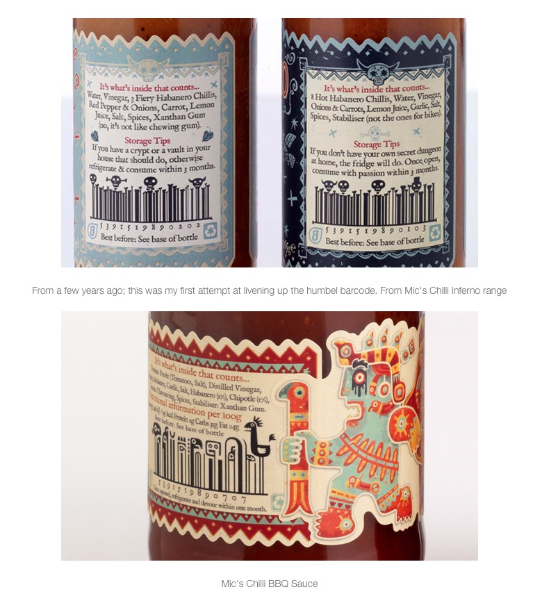
Illustrated barcodes? @stevesimpson explains these and more at Outstanding By Design

You know when a designer gets full reign to do whatever their imagination dictates. That must have been what the relationship between Steve Simpson and Mic Wejchert of Mic’s Chilli must have been like. Can’t wait to hear the pair of them at Outstanding By Design.

These screenshots taken from Steve’s Dropr page.

Screenshot 2014-05-04 14.57.11 Screenshot 2014-05-04 14.57.00

More details and a booking link for the day (next Saturday 10th May) here.

Keith

Time flies…and Biabeag is going to change a little

Been a long while since I last posted here and in the meantime have been working in my other life on some interesting online projects.

Picking up this blog and starting again – with a twist. The same core emphasis on food the way it should be – describing it as artisan, local, slow, organic, ethical seasonal or small (beag). But now moving beyond the producers whose passion and energy drives all of this and into the world of the larger businesses which support that passion.

They could be online retailers, real world brands, distributors or ones which blend the older business models and bridge the gap between consumers and producers. In all cases it won’t just be about food – they will all have at their core good food produced properly.

Terra Madre and Salone del Gusto

As part of this revitalised focus I am really looking forward to being part of the Irish Slow Food contingent in Turin, Oct 2012 – the Terra Madre and Salone del Gusto event. Check out this video.

Keith

Artisan food producers, Co-Op Sweden

One of the many decisions to be taken by a food producer as their business grows is whether to supply large food retailers with own brand products.

The elements of this decision involve scale, loss of brand awareness, margins, cashflow and dedication of resources to a part of the business which may not be core to their plans in the future.

Not every large retailer is the same and that is part of the complexity. If the decision involves retaining the producer brand as part of the product packaging then that can mitigate that element of the compromise.

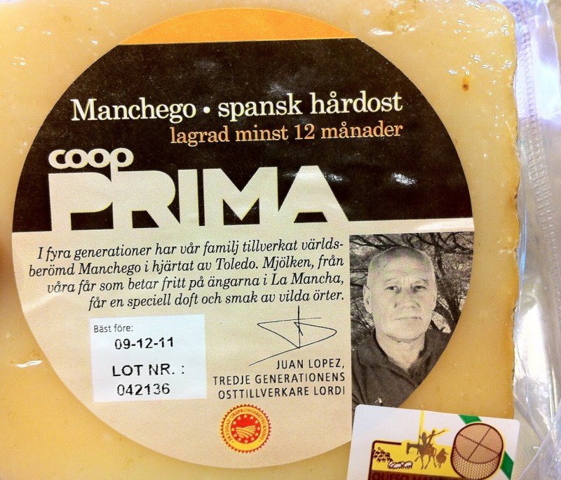
This is 2 product shots from the Co-op chain in Sweden (taken while on holiday recently in Stockholm). In each you can see the consistent way in which the producer is named and credited on the packaging – adding to the authenticity of the range. This is a link to the page (in Swedish) on the Prima range which these are taken from.

From that page “We’ve tasted our way to the very best and will start with 50 carefully selected delicacies. All are original label and produced by suppliers with a passion for really good food. Now it’s your turn to enjoy the Coop Prima.”

Like that a lot.

Keith


Artisan and local food packaging examples No.6

For me a food brand is nothing without the people behind it and this batch of packaging designs picks up on that theme as a way of connecting their brands with consumers on the shelf edge.

Peeze by SoGood
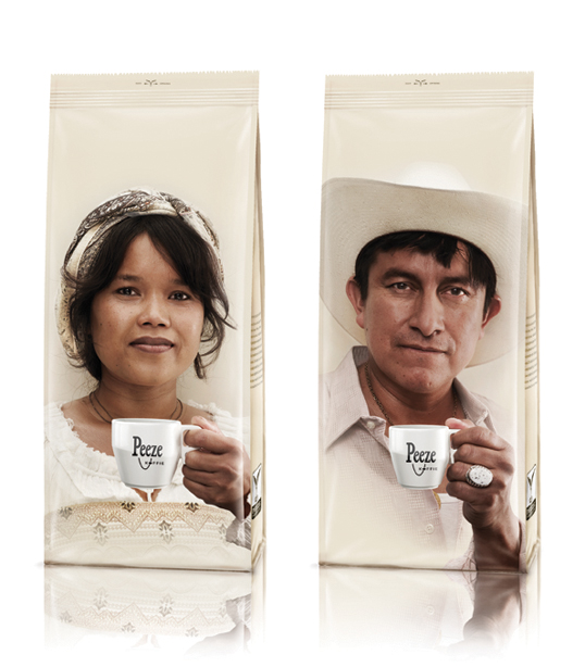
I have seen this regularly from smaller coffee brands – especially those who work with Fairtrade systems. Very interesting comment on the blog post this came from: “this is ridiculous. designed for a bunch of white people on the netherlands so they can see the “many colors” of the developing world without feeling bad about how people get exploited. commodification at its best.”

Fair point – a quick glance at their website and they do not appear to use any of the mainstream Fairtrade certification although they could still have strong and supportive relationships with their suppliers.

Nice packaging one way or another!

via Lovely Package

Sigtuna by Morkman


Putting it out there – this is superb. A micro brewery close to Stockholm where the Chief Brewer Mattias is not afraid to get up close and personal with his customers. For any and all Irish artisan and local food brands – be bold. This IS about you and don’t be afraid to show it 🙂

[note – the brewery concerned do not appear to have a website – this is a good interview with Mattias]

via Lovely Packaging

Sweet and Hot by Ivanna Shashkina
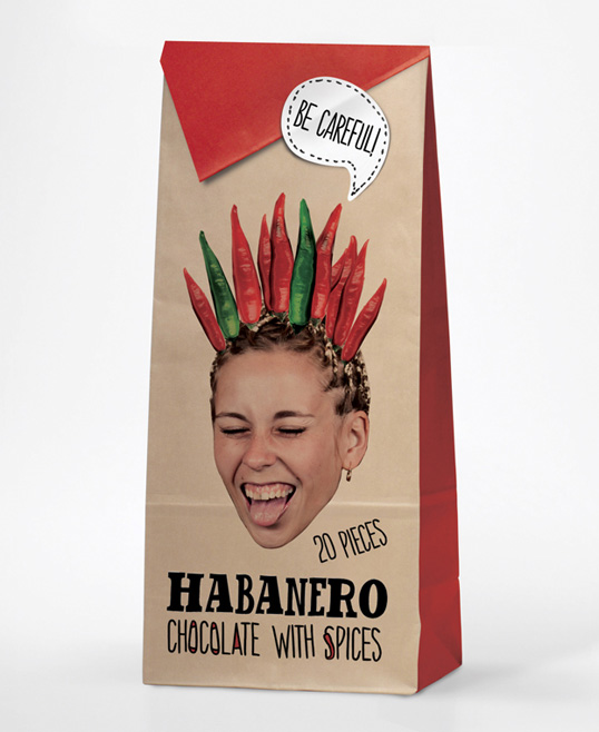
Part of the fun of Lovely Packaging is that they feature student design work regularly. This one is really effective and shows how humour could be integrated with the people theme.

via Lovely Packaging

Eno by LPW Studios

Nice blend of people and a retro feeling to give these wines a strong visual identity on the shelf. Both the winery owner and the designer have contributed in the comments – here is part of what Sasha from the winery said: “Some context- each year we change the label design (but keep the same typographic treatment of the logo, wine detail, etc). This particular year, 2004, was “a family archetypes”. Hence the names and the pictures of family members.”

This is important – the people concerned are real people and this brings this design execution beyond the realms of just another whim/concept dreamed up by the designer. For artisan food brands that authenticity is so important – and so easy.

via Lovely Packaging

If you liked this check out other packaging posts in this series here.

Keith


Chocolate Garden Visitor Centre

I have seen their workshops mentioned on Facebook a couple of times but never had a chance to visit their premises close to Tullow until yesterday. Mentioned them briefly here just before Christmas when they had a pop-up shop in Kilkenny.

Jim and Mary Healy have been working on the Chocolate Garden brand for years now and when I last spoke to them a couple of years ago they were finalising their plans to move into a new production premises and visitor centre behind their home and beside Rathwood garden Centre.

What an amazing range of products – and the chance to attend chocolate making workshops as well! These chocolate lolly’s caught my eye, as did the chocolate fountain. A lot classier than some I have seen!

If you are traveling close to Carlow check them out.

keith


Artisan and local food packaging examples No.5

Braufactum by Flaechenbrand

This is a superb example of upmarket positioning by this craft brewery which was set up in Germany in August 2010. Take a look at the full post – the detail of every aspect of the bottles and labels is worth a couple of minutes of your time.

via TheDieLine

Brooklyn Gin by Spring Design Partners

Ok – more detail, hmmm. Looks like my post has a very premium positioning theme. And allowing myself a quick mention of their website as well:

That shot and description on their homepage is very evocative and oozes authenticity – the source and production backstory is one every artisan website should get into your face immediately.

Back to the design – “The bottle structure pays homage to the apothecary origins of gin, reinforcing its place in the new speakeasy, while the medallion label – stamped in metal – celebrates the authentic spirit at the core of the brand”. Always important to be clear on what is to be achieved with each aspect of a brand from website to labelling.

via TheDieLine

Love both of these – this is packaging which is expensive however there are lessons to be extracted for every brand.

Keith