Cheating here, this is a guest post done for me by Liz in 2011 (5th May, almost 3 years ago!) and bringing it up the blog because Liz and Mella are one of the pairings in Outstanding By Design on 10th May. She may not like me for not updating her photo 🙂
Elizabeth Maybury who shares the story of the Mella Fudge packaging design including some practical stuff on her experience of finding printers for the work. I first saw Mella Fudge in Partridges Fine Foods shop in Gorey.
This is Elizabeth
and this is her post:
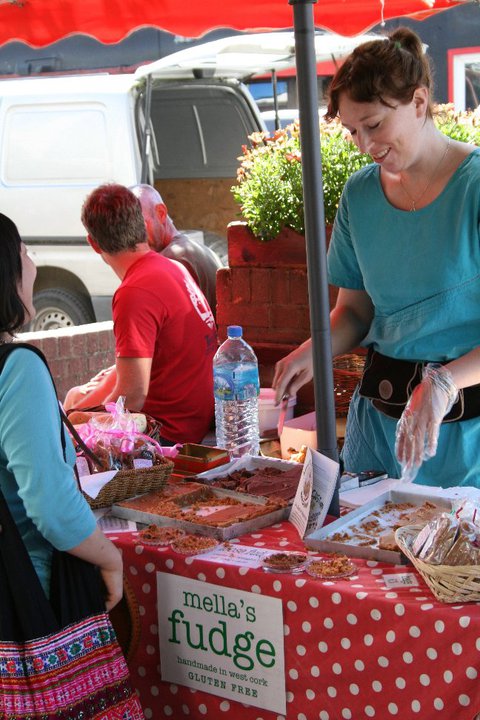
Mella’s Fudge is based in Clonakilty, Co. Cork and produces the most amazing, buttery, crumbly, handmade fudge you will ever taste! The fudge currently comes in four flavours – vanilla, walnut, rum & raisin and chocolate.
I first met Mella a couple of years ago when I redesigned her logo. Mella’s name comes from the old Irish word for honey, which is represented in the logo by a little bee which forms the apostrophe of Mella’s. Honey is sugary, tasty, a treat – sharing the same sweet traits as fudge.
The brief
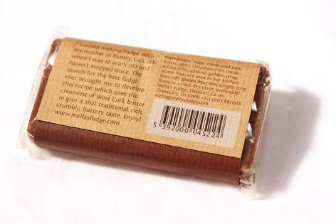
When it came to the packaging, the aim was to communicate that the fudge is a premium quality, luxury product, but also that it is handmade in a kitchen by Mella rather than mass produced. Mella asked me to incorporate gold foil somewhere on the packaging and I really wanted to use Kraft ribbed brown paper, so I thought the two combined would be a good way to communicate both the luxury (the gold foil) and handmade (the brown paper) qualities of the fudge.
Use of Colour
There is one colour to represent each flavour, making it easy to differentiate between each, but also complimentary when displayed together. The wrapper was carefully measured so that the edge of the bar would remain visible, even if there were slight discrepancies in each bar’s shape (it is handmade after all).
Sourcing a printer
The difficulties began when I went to source a printer. Most refused to even quote, as apparently gold foil on brown paper isn’t a very common request (who knew!). Finally I tracked down the wonderful Glennon Print in Ashbourne, Co. Meath (sadly they have recently ceased trading).
Reading the barcode
You will notice that the barcode is printed on a white background box. This was to ensure there would be enough contrast between the barcode and the background so that barcode readers could pick it up. Cue many test trips to my local shop to make use of their tills and try out the barcodes in various colours on various papers. Finally we decided the white background was the safest option as directly printing on the brown background was having unpredictable scanning results. So after several weeks of tests like this, ink checks, gold foil on Kraft tests, meetings and samples the job was finally ready to go to press.
The Press Check
I travelled up to Ashbourne for the press check, as the colour of the inks would change unpredictably when on the brown paper and they had to look exactly as intended. Several adjustments later and they were perfect. After printing they were sent out for gold foiling before being delivered to Mella in West Cork.
This was definitely one of the most challenging but also the most enjoyable projects I’ve worked on. Mella and I were both happy with the results, and I really appreciate that Mella let me go with this when we were being told so often that gold foil on Kraft wasn’t possible. Glennon Print were brilliant to work with and put so much time into this.
Mella’s Fudge is stocked by Sheridan’s, Fallon & Byrne and others. Mella also sells her fudge at Bantry Market on Fridays and Schull Market on Sundays. The full list of stockists is available on her webpage www.mellasfudge.com
Elizabeth’s contact details:
www.elizabethmaybury.com
http://lizmaybury.blogspot.com
Twitter: @lizmaybury
More on the full day on 10th May here and you can book there too 🙂
Keith


