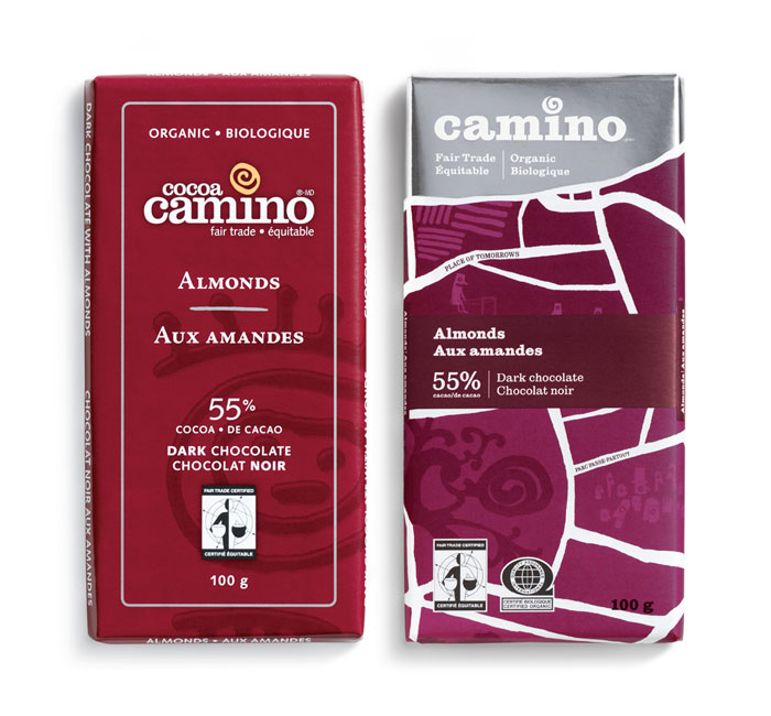
Couple of nice “Before and After” examples here from dieline
became
From the designers: “The identity is a daisy chain illustration of their process and the care they take in growing and handling ingredients to delivering great quality with the benefits of eating and feeling better.”
A great example of a product which in its previous version you would classify as a medicine – don’t purchase unless you have to – moving to a cheerful and desirable product catering for a specific consumer niche.
via Dieline
Camino by Karacters, illustrations by Chris Haughton
From the designers: “the brand idea “a joyful food revolution” captures Camino’s belief that through the joy of eating great tasting food made from quality ingredients, people will be encouraged to think differently about their food – where it came from, who made it and what’s in it.”
This idea of celebration and joyfulness comes up a lot in my work with artisan brands – connecting people with the food they eat in a way which compromises neither taste nor the process which produces the brand.
via dieline
Keith


