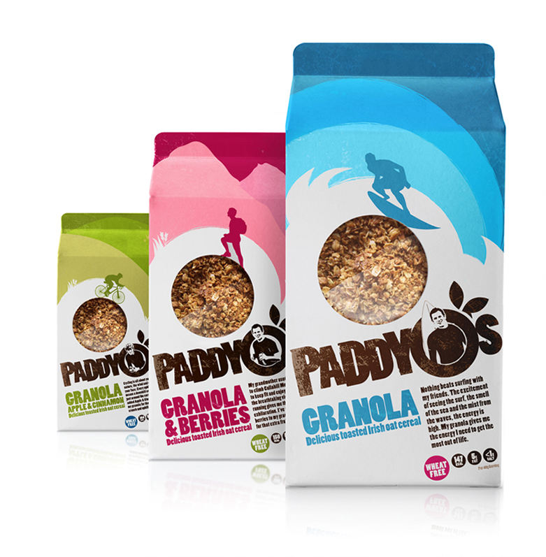
This is the latest post featuring the brand and packaging designs which will be discussed on 10th May at Outstanding By Design.
I first met Paddy at the Waterford Harvest Festival in 2010 – you can see him and the first packaging below!
Since then the business has grown in leaps and bounds and he commissioned Brand Union to do a full piece of work on the overall visual identity and his packaging. This is what Sarah Maguire had to say about the work they did:
We were excited to meet Paddy for the first time. We had of course heard his story; college graduate starts making his own granola in a room above his parent’s pub and selling it at local farmers markets. In a short space of time, he found himself with a thriving small business, and Paddy O’s Granola was born.
When Paddy came in to chat with us, it became very clear how this guy had achieved so much in just a few years. His enthusiasm, energy and passion filled our meeting room. As we got to know Paddy we could see that these traits were not limited to his business approach. It’s his way of life, and it’s infectious! Yet his brand didn’t reflect these qualities.
With the brand positioning reworked to truly reflect Paddy’s approach, ‘Get the most out of life’ gave us our starting point for the creative thinking. I worked closely with the design team to think about how we could realise this on pack in a true and compelling way.
We knew the product was all natural, tasty, and good for you. What we really needed to dial up was the end benefit. So we focused on three of Paddy’s favourite sports, drawing from his real life experiences and memories. His hill running story is inspired by his own Grandmother who used to go up the same hill every day, all of her life. Obviously high energy levels run in the family!
This was brought to life in an illustration style featuring Paddy himself, with a new pack format for better shelf standout. The approach was to be simple, graphic, and striking, with a characteristic ‘O’ window to reveal the great product within, and to serve as the basis for each different activity reflected on the different flavour packs. The strong and simple colour palette really helps it stand out in a busy category.
The rebrand has been hugely successful for Paddy. By sharing his new brand look and feel as part of his entry into a media competition, he won €150,000 worth of outdoor advertising space, has had a 100% lift in sales since June 2012, and increased nationwide listings of the brand. Now Paddy is getting the most out of his brand, as well as life!
You can hear Sarah and Paddy talk more about the process they went through on 10th May – information and tickets here.
Keith

