Muesli and Granola – 5 different artisan products, 5 very different brands

Came across a couple of striking examples of cereal packaging in Avoca during a recent visit and they inspired this post. The area of brand, logo and packaging is one which can result in very different styles – even within the brief of taking a mix which is lovingly and passionately brought into the world by an artisan producer.

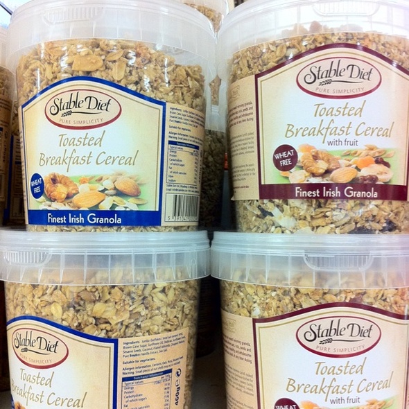
Staple Diet – http://www.stablediet.com/

This is a Wexford based business going since 1995. They do a variety of products and to my eye the brand is presented quite conservatively – especially compared with the others underneath. Ironically the container they use is reusable for storage afterwards so they score points for that.

However as both Flahavans and Ballybrado have shown recently traditional products do not necessarily have to retain an old fashioned feel – or at least can combine hertitage with a more contemporary feeling.

Paddy O’Granola – http://www.granola.ie/

Elements of the approach similiar to Staple Diet in that the packaging is clear so the product shows through. This is a first generation package (the business is based in Co Tipperary having started in 2010) and I have a feeling that I saw generation two very recently but I did not take a photo of it and cannot see a reference online anywhere. UPDATE – they made a reference to their new packaging on Facebook, however not out yet.

Thanks to TheDailySpud for the shot above.

Drumeel Farm

Without a website to refer to I cannot see much about this business except that they are based in Longford (I think) and they are an on-farm enterprise. Solid container like Staple Diets but contemporary feel to the imagery used.

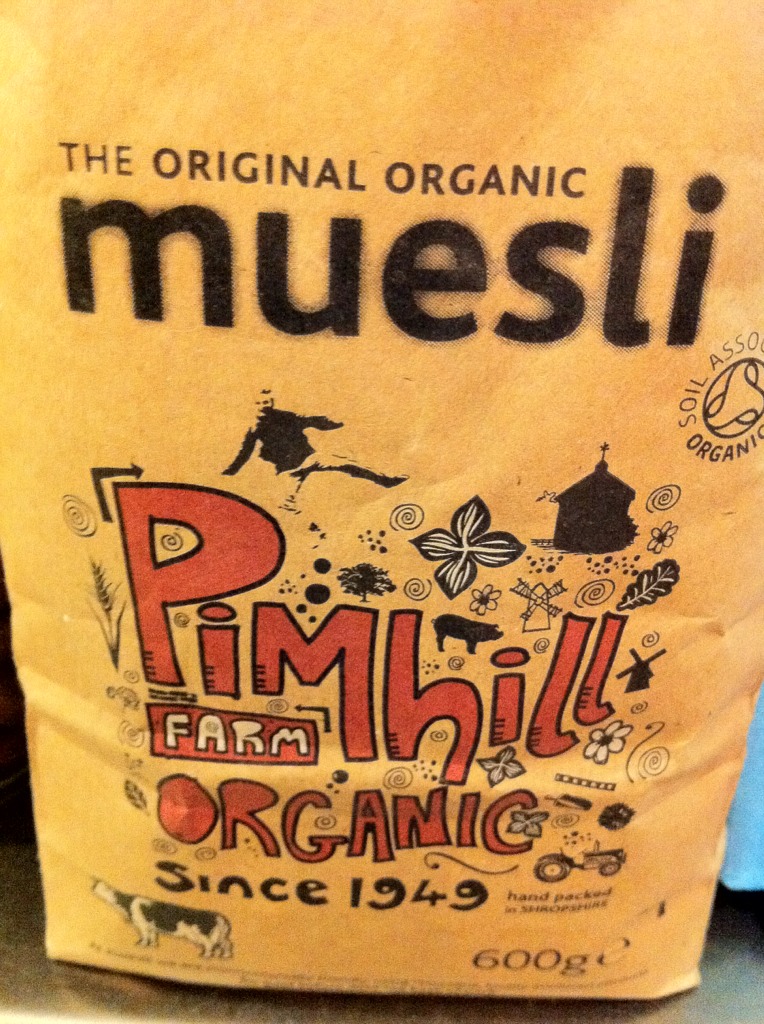
Pimhill Farm – http://www.pimhill.com

More heritage (organic since 1949) and with packaging which reflects a rebranding to “has been re-branded to appeal to today’s market and reflect the unique and quirky essence of Pimhill to deliver wholesome, tasty and nutritious organic food – without the use of any artificial fertilisers or chemicals”

I like this one.

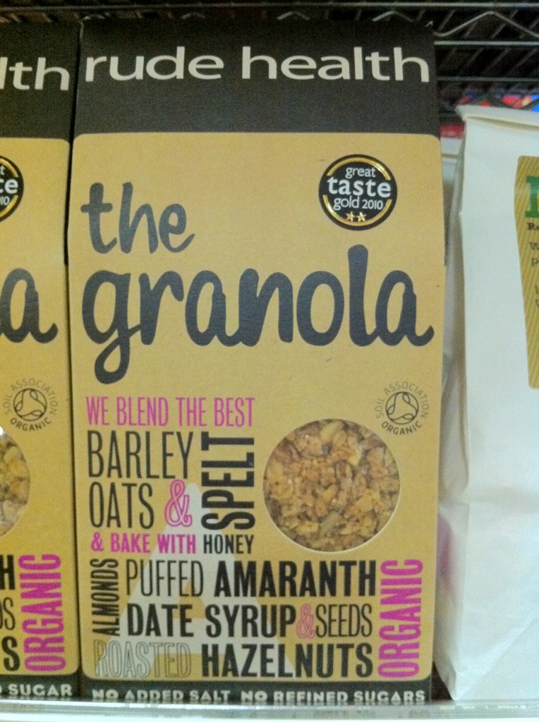
Rude Health – http://www.rudehealth.com/index

It’s organic as well. With the passion, without the same heritage. Totally contemporary feel to their brand, the most modern of the ones in this post. On their packaging “The cardboard we use to box our cereals is made from 100% recycled material, and is 100% recyclable – please do your bit. Yes, yes we know there’s a plastic bag inside, but that’s the best way to stop the cereal getting damaged, which would be the biggest waste of all.”

Also like this – for me both of the above are strong and allow you to pick out their core brand strengths with a quick glance. For the Irish brands this is the competition – both as they export (particularly into the South East of England where a number of companies I have chatted to recently are very strong) and also on the shelves of specialist retailers in Ireland.

Being Irish and local is important – however so is doing yourself justice in a cost effective manner on the shelf-edge.

Any cereals you particularly like?

Keith
Artisan and local food packaging examples No.3

Been a couple of weeks since I did one of these.

Mammoth Supply Co by Shine

This is a dairy brand specifically for men. Interesting positioning. I like the name and associated mammoth icon and the use of large typeface. Effective.

via dieline

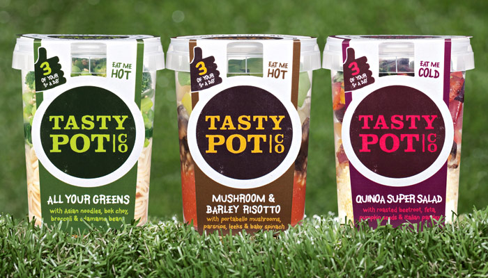
Tasty Pot Co by Beyond

Another New Zealand brand with a strong use of colour combined with a repeat of the large typeface and a hint of a handwritten font for the variety name. This would stand out on the shelf and it works for me.

via dieline

Frisk Yogurt by Mats Ottdal

This appears to be a concept design from 2008 – this is a yogurt designed for kids and it is very appealing

via LovelyPackaging

Vermont Coffee Co by Place

Yes please – they used a 100 year old press to get an authentic feeling of integrity for these.

via dieline

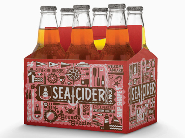
Sea Cider by I Love Dust

This very busy carry pack manages to strongly evoke a seaside feeling. Nice.

via fffound

That’s it for this post – loads in the backlog so must get to the next one in the series a bit quicker next time.

Keith


Quick one – keep an eye open for this packaging seminar

Over on the newly launched Bord Bia Vantage forum Stephanie from Bord Bia left this comment:

Bord Bia’s Small Business Division will be organising a food packaging seminar later this year (currently planned for October) to advise companies of everything to  consider when developing new packaging. More information will be available on www.bordbiavantage.ie later on in the year.

Must try and get to that 🙂

Keith

Irish Artisan and local food brand/packaging designers

One of the things I have been trying to do for a while over on the Irish Food Base is find a way of presenting information which I come across on the designers who have worked on Irish food brands and packaging.

I have now settled on a relatively simple and visual format for that and I have published it over on this page.

I will continue to add brands and designers slowly over the coming weeks and months – if you have any to add to the list please let me know. Hopefully it will be of some assistance to Irish artisan and local food brands who are considering new projects and who need to find experienced food sector designers to work with.

Keith


Artisan and Local Food Brands – Irish Media Watch No.2

Irish Times – Saturday 22nd January – Article here

In an article entitled Tipple that won’t make you tipsy Tipperary brand The Apple Farm are mentioned. The journalist John Wilson says “It is cloudy, lightly sparkling with lovely, pure apple fruit flavour.”

Irish Times – Thursday 20th January – Article here

This is a great piece about Cork based Taste A Memory

On the back of the IBEC survey which showed that Irish food companies are more positive about their prospects than Irish business overall the piece shows how a focus on design and packaging by this brand had a positive impact on their listings and sales.

Ann Bradfield, the chef behind Taste A Memory, also recommends a spend on in-store tastings to boost awareness and sales.

and in other somewhat relevant news

“59% of Americans want better online access to Irish Food”

A commercial opportunity awaits – see Slide 31 in this post here from Amarach.

“Street food vendors are expected to populate sidewalks every two to three blocks downtown by the summer of 2014”

This decision in Vancouver will open up opportunities for local food suppliers with staff in the council screening applicants for, amongst other things, the use of local, organic and fair trade foods. Full article here.

“Green & Black’s ‘to seek split from Kraft'”
This brand does not belong in the arms of a global conglomerate. Would be good to see it independent again. Examiner article here

Keith

The role of design in artisan food packaging

Thanks to Kristin (whose blog is dinnerdujour) for the hat tip which lead to this post.

Written by Alexandra Lange on the design blog DesignObserver.com the full post entitled What Should Food Look Like poses a series of questions around the percieved norm in packaging design for food products which are artisan/ local/ healthy/ organic/ different in some way.

Using a range of examples Alexandra suggests:

If we want to cross class lines, and get everyone to eat better, wouldn’t it make sense to come up with packaging that was neither tacky nor classy? We need a new identity for plain, simple, grandmother-would-recognize food? Not patronizing, not upscaling. Middlebrow chips? Neutral beverages? We need supermarket aisles stocked with food, not messages about our income level.

Which is an interesting question. And to be honest for me is completely irrelevant for most of the food producers I write about. While passion for a society which eats better and which respects food which is produced properly (however defined) is core to every artisan producer I would suggest it cannot override the need to develop a brand (logo, name, packaging materials, fonts, colours, photography) that allows for clear and immediate positioning on the shelf edge.

Yet maybe there is something in the proposition to think about. A shift down a gear or two with a less pronounced high-brow brand and a more accessible visual impact could produce higher volume sales.

What do you think? For me it is a brand by brand decision and cannot be accommodated in a sweeping discussion which belongs at government or lobby group level.

Keith

2 packaging and design posts this week from Irish artisan brands

These do not happen too often – it is difficult enough finding time to run a food business without finding the time to blog about it.

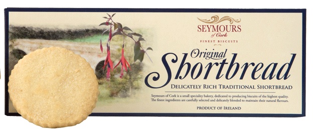
Seymours is a handmade biscuit brand in Cork and they were full of praise on Thursday last week for Michelle Jones of Microstreet Graphic Design for her work in developing the packaging.

There are no contact details for Michelle that I can find online – however her husband has a website here.

Meanwhile in Limerick Lorraine from italianfoodies continues to share the development of a new food brand by herself and her husband. They currently run La Cucina and the brand will initially be for a range of sauces. She had this to say about the process:

We’re currently at the branding stage which is a very detailed process, I presumed you hired a graphic designer, they design a logo and there you go!! Ah no sireeee!! The brand has to represent what we stand for – family, culture, Italian lifestyle, passion, natural, local,  good quality etc etc and it is pretty difficult to get all this into a couple of words and a graphic, we are on the way though and get closer every meeting we have with the designers but it is all I have been thinking about for the last couple of weeks, we’re off to London soon to see if we can get any inspiration over there, they market artisan food very well in the UK and I think Ireland should look to them on how it is done….


This stuff is difficult and important to get right. I cannot wait to see what they come up with.

Keith


Artisan and local food packaging examples No.2

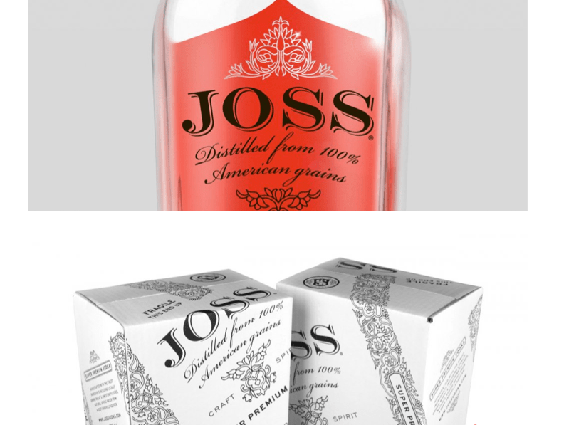
Joss Vodka

Glamorous, stylish, fashionable, relaxed. And award-winning (2010 San Francisco World Spirits Awards Double Gold Medal)

Check out the blog post from the designers. The vodka comes from Sòlas Distillery, an American craft distillery located in La Vista, Nebraska. Not sure where the name comes from but there is a Brian Magee mentioned as a co-founder.

via ffffound

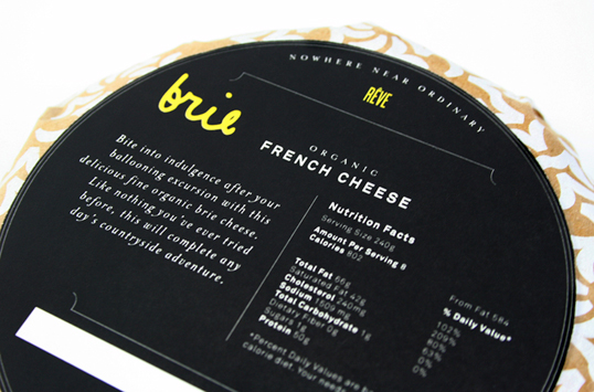
Brie by Laura Berglund

A student concept from Laura Berglund which is an unusual and striking label design for a brie cheese – showing how the nutritional information can be accomodated front of pack without taking away from the design.

via lovelypackage.com

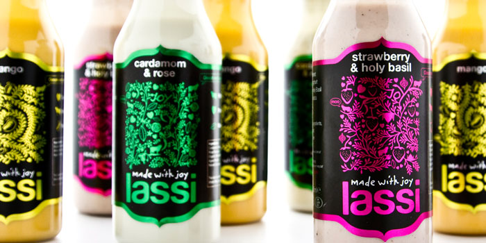
Made with Joy Lassi

A strong Indian influence which has a colourful impact.

The website for the brand is here.

via TheDieLine

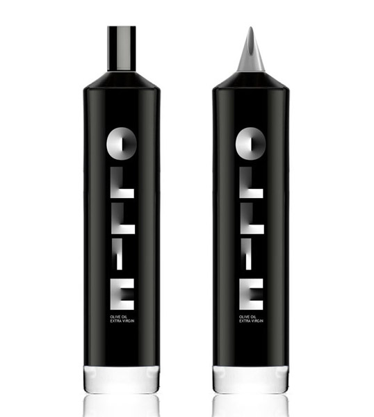
Olive Oil by Alexandr Chernov

Does this work? I’m not sure – the font is relatively unreadable so it would defeat a quick scan in a store. But it does differentiate – and for artisan/local food brands that is important.

via LovelyPackage

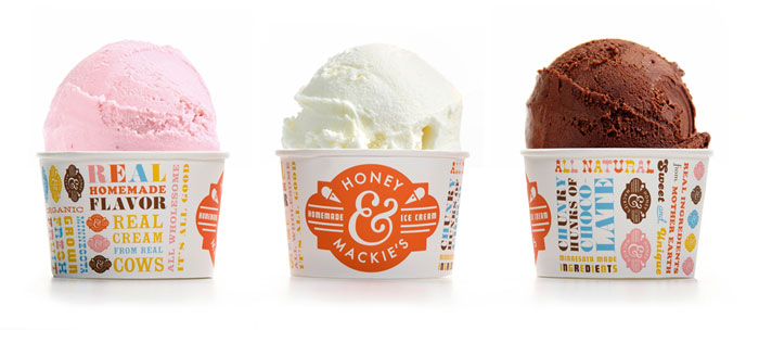
Honey & Mackie’s Icecream Shop

Modern, authentic & kid fun. You can bet the designers in Wink must have enjoyed working on this.

via TheDieLine


Keith


Irish Food Producers & Social Media: Tastefully Yours

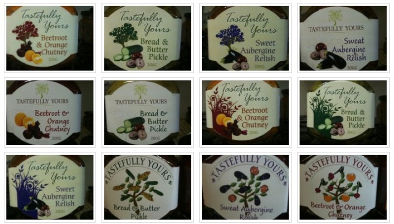
Have just done an Irish FoodBase entry for this Waterford based brand (on the back of their Bridgestone Megabites award) and came across this on their Facebook page:

“We need a little help from our friends. We are in the process of creating a brand logo and new labels for our products. There are five different designs to choose from or we can pick individual components from any of them and come up with a final one. We would appreciate your comments.”

There were 7 comments left with some good informed assistance and they did appear to go with the overall opinions expressed for a clear favorite (which was the one in the top left).

Good simple use of Facebook to help crowdsource a decision.

Keith

Artisan and local food packaging examples

First two from Scandanavia and Dieline.

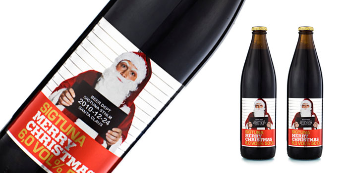
The first is a humorous take on Santa at Christmas – used by a Swedish micro-brewery near Stockholm. Can imagine these being strong on the shelf edge.

via Dieline

The second is a range of gingerbread and the brief was for packaging for the best gingerbread in Finland in time for Christmas 2010. Very contemporary.

via Dieline

The next two are student concepts and come from the Lovely Package blog.

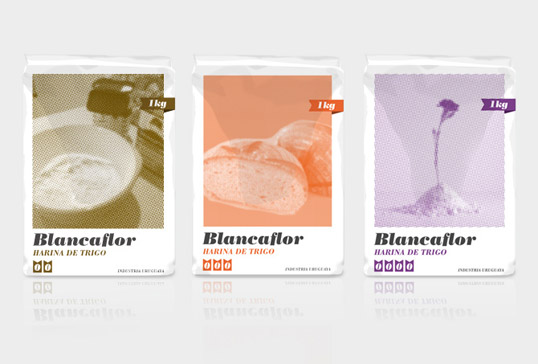
This one is from Martín Azambuja in Uruguay. “The project was to design new packaging of flour for people who like cooking. I decided to use two colours and a reticle picture.”

Strikingly different from the flour packaging which I am familiar with here in Ireland.

via Lovely Package

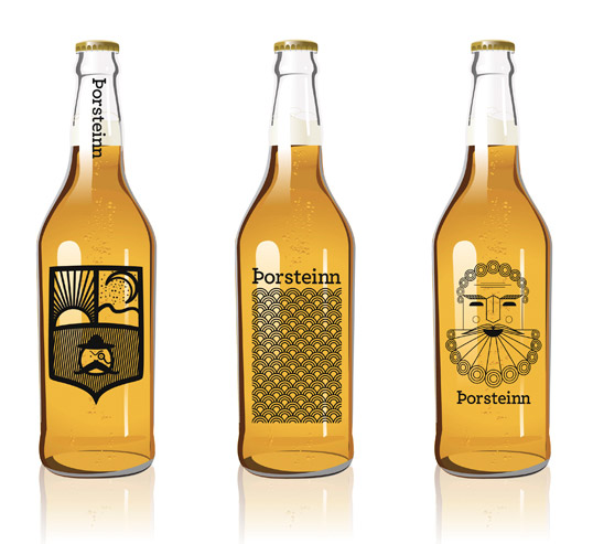
The second is from Thorleifur Gunnar Gíslason in Iceland – more accurately he is credited but the work is from a group of 3 students. Again for a micro brewery the brief: “The concept is a simple one. One beer, 10 different bottle designs by 10 different designers. The design would be changed annually. The design could be put on beer glasses as well. The design is limited to black graphics on a 33cl glass bottle.”

You can see see 3 of the designs below. All 10 on the blog post linked underneath.

via Lovely Package.

keith