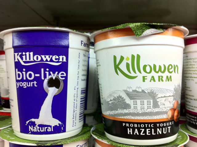
Made for Biabeag – a side by side placing on the fridge shelf of the before and after packaging for Killowen Farm. (I cannot find a website for them, however this link (direct to pdf) gives a little more information)
This redesign was launched in April this year as far as I can tell and seems to have involved:
* Significant work on the main logo to make it much more contemporary in terms of font and colour.
* Addition of the word Farm to the logo to add to the positioning and provenance
* A black and white image of the farm (I assume) to tap into the authenticity message
* Colour ingredient shot to make visual identification clearer
On the back of the pack:
Here we have a update in the story being told to:
* Pick up the name of the family involved (the Dunnes)
* Handcrafted is new, as is the highlighting of no colours, preservatives or additives
* Carried over is the word unique and the phrase smooth, rich milk
Like the new design a lot – much more effective.
Keith


One thought on “Killowen Farm packaging and brand redesign”
Comments are closed.