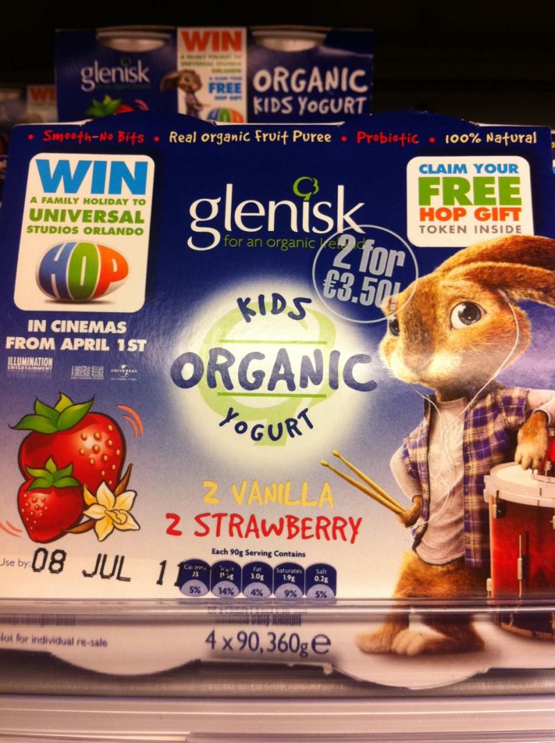
This fascinates me – the different packaging design approaches to an identically positioned product.
Glenisk – www.glenisk.com
Personally I am finding this kinda messy – but I don’t doubt for a second that it is effective.
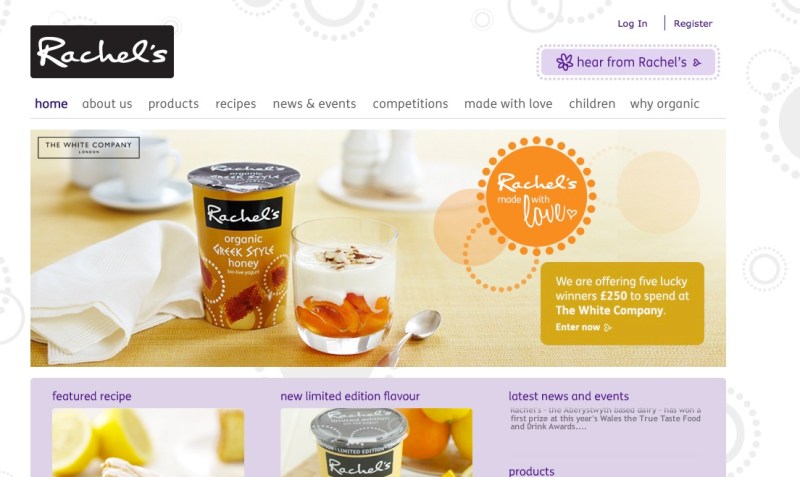
Rachel’s – http://www.rachelsorganic.co.uk/
For me much clearer messaging = strong fruit statement, very readable text and parent-appealing shot of baby.
I do wonder which is more effective – or have the two brands differentiated the market by targeting different profiles within the organic food purchasing parent population?
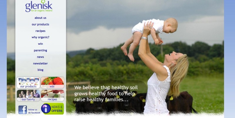
As a by the way check out their respective homepages for a quick comment on brand consistency:
To my untrained eye the Glenisk packaging is very much at variance with the website (which itself could do with a rework and update to make it more consistent) and even the Rachel’s website contains subtle brand design references which are not yet reflected in this packaging.
I guess this is the bane of marketing peoples lives – having a large product portfolio and multiple channels/manifestations of the the brand which all need updating once the core brand design and messaging are changed.
Keith


