What is Packaging Design?

This book by Giles Calver, who is with us for the day during Outstanding By Design on 10th May,  is now a reference for design students in the UK. It is strongly visual while containing a lot of very useful guidance around the application of brand within packaging.

It is not specifically just for food but contains a lot of food case studies.

Some excerpts with my comments on same:

“..with the prominence of branding, packaging is often the living embodiment of a brand’s values and personality”

> Packaging is important – but only part of the overall picture. If you don’t have a good grasp of the core elements of your marketing messages and branding positioning your packaging won’t make much difference

“Packaging’s primary face….should engage with consumers, attracting attention, triggering consideration”

> Your Packaging has only one goal – to sell your product. The design – a combination of the visual elements and the text – should be rigidly focused on that.

“The central message refers to the main persuasive issues or arguments.. the peripheral message refers to all other tangential elements…”

> You will have difficult choices to make – deciding what are the key 1 or 2 reasons why a consumer purchases your product/brand and ditching the rest in the packaging design 3 is the absolute limit – this is already too many messages for a consumer to scan.

“a brand becomes a compound of tangible and intangible values, the latter being formed in consumers minds it is very important to define your intangible values…packaging design can..portray these..”

> If you are a start-up your brand has no heritage so consumers start from scratch in sub-consciously deciding what the brand stands for. They will take a lot of their cues from the packaging and if you get it wrong your brand will suffer and you will loose control even faster

Giles will be with us for the full day during Outstanding By Design on 10th May and he will be available for 1 to 1 meet ups.

More information including the full line up and booking here.

Keith

Outstanding By Design – look at the range of design experience in the room :-)

The individual designers, larger companies and agencies who are on stage on 10th May have worked with the following food producers, restaurants and other food companies:

  • Bo Bristle
  • Donnelly
  • Pop Noodle
  • Saba
  • Pure Brazen
  • Skoff Pies
  • Total Produce
  • Finches
  • Glenilen
  • Cully & Sully
  • Dee’s
  • Rachel Allen
  • Paddy O’Granola
  • Galtee
  • King Gold Standard
  • Hodgins Craft Butcher
  • Country Kitchens Bakery
  • 8 Degrees
  • Firehouse Bakery
  • Gubeen
  • Mic’s Chilli
  • Fade St
  • Ed Hicks Bacon Jam
  • Mella Fudge
  • Dunnes Soups
  • Indulge Chocolates
  • Kerry Foods
  • Shellfish Ireland
  • Chilly Moo
  • Follain Preserves
  • Cavistons
  • Johnnie Walker
  • Cadbury Cocoa House
  • Tanqueray
  • Gordon’s
  • Windsor Diamond Jubilee
  • Chivas Brothers

That is an amazing array of design talent which each attendee will have access to and it is not comprehensive by any means!

Click here for more information.

Keith

Outstanding By Design – Skoff Pies

This one will be interesting, a food service company moving out of the shadows via own label production with a new and strong consumer brand.

Liz Skehan will share the story of her collaboration with Creative Inc on 12th May at Outstanding By Design but to whet your appetite here is a summary from Creative and a couple of behind the scenes shots taken during the process.

As you can see there is an understandable emphasis on Donal in the public face of this business but the role of Liz and her husband will be interesting to reveal.

Working closely with Donal and the Skehan family, it was important for us that his personality and love of all things retro was reflected in the new identity and packaging. The typography and stark graphic teeth are a playful homage to the works of iconic American designers such as Roy Kuhlman and Paul Rand.”

For more information on the day click here.

Keith

Paddy O’Connell and his @paddyosgranola brand

This is the latest post featuring the brand and packaging designs which will be discussed on 10th May at Outstanding By Design.

I first met Paddy at the Waterford Harvest Festival in 2010 – you can see him and the first packaging below!

Waterford Harvest Festival - Ireland

Since then the business has grown in leaps and bounds and he commissioned Brand Union to do a full piece of work on the overall visual identity and his packaging. This is what Sarah Maguire had to say about the work they did:

We were excited to meet Paddy for the first time. We had of course heard his story; college graduate starts making his own granola in a room above his parent’s pub and selling it at local farmers markets. In a short space of time, he found himself with a thriving small business, and Paddy O’s Granola was born.

When Paddy came in to chat with us, it became very clear how this guy had achieved so much in just a few years. His enthusiasm, energy and passion filled our meeting room. As we got to know Paddy we could see that these traits were not limited to his business approach. It’s his way of life, and it’s infectious! Yet his brand didn’t reflect these qualities.

With the brand positioning reworked to truly reflect Paddy’s approach, ‘Get the most out of life’ gave us our starting point for the creative thinking. I worked closely with the design team to think about how we could realise this on pack in a true and compelling way.

We knew the product was all natural, tasty, and good for you. What we really needed to dial up was the end benefit. So we focused on three of Paddy’s favourite sports, drawing from his real life experiences and memories. His hill running story is inspired by his own Grandmother who used to go up the same hill every day, all of her life. Obviously high energy levels run in the family!

This was brought to life in an illustration style featuring Paddy himself, with a new pack format for better shelf standout. The approach was to be simple, graphic, and striking, with a characteristic ‘O’ window to reveal the great product within, and to serve as the basis for each different activity reflected on the different flavour packs. The strong and simple colour palette really helps it stand out in a busy category.

The rebrand has been hugely successful for Paddy. By sharing his new brand look and feel as part of his entry into a media competition, he won €150,000 worth of outdoor advertising space, has had a 100% lift in sales since June 2012, and increased nationwide listings of the brand. Now Paddy is getting the most out of his brand, as well as life! 
Paddy O"Granola

Paddy O”Granola

You can hear Sarah and Paddy talk more about the process they went through on 10th May – information and tickets here.

Keith


Meet the Cheese Makers – thank you

Last night was great, it went really well. Thanks as always to Julie and Rod our hosts in Highbank Orchard for the work they put in getting the room ready for the event. You can see it here, thats a lot of effort and works so well.    Our 3 makers shared so much about their stories and the making of their cheeses. And samples were passed around constantly! Accompanied by baguettes from the Spelt Baker. The 3 again were:

I am waiting on a full set of photos of the evening so here are a couple shot by me.

This is the raw video of the entire Biabeag Meet The Cheese Makers event on 5th April at Highbank Organic Orchard. With us were:Thanks to www.memoirsoncamera.com for shooting for us. All post production failings are mine!

Some timing notes:

5:22 Siobhan

38:55 Helen

1:08 Tom

1:40 General Q&A including a couple of opportunities for people considering entering the artisan cheese market

1:42:30 Specific discussion around scaling an artisan food business through to end. This one was initiated by me and I found it really informative.


There was a audience of 60 in the room and on a show of hands between a third and a half had travelled from outside Kilkenny. That is so good to see – thank you for making the effort to join us and celebrate these makers and real cheese 🙂

Next up is Outstanding By Design on 10th May – a brand and packaging day mostly for food producers

Meet the Craft Brewers is on 7th June (8 Degrees, White Gypsy and Metalman)

Meet the Roasters is on 20th Sept (Ponaire, 3FE and Badger & Dodo)

Keith

Katu Honey, Laura Macaulay and Value Added in Africa

My original goal for Outstanding By Design on 10th May was to feature case studies of great Irish food visual design and packaging. It made sense given the strength of the work done here in Ireland.  For that reason I omitted a number of really strong food brands whose work was done by UK based agencies.

And then Laura emailed me with details of the work done by Value-Added in Africa, a not-for-profit based in Dublin and which works with charities in Uganda. I’d recently met with Michael Carey and the memory of his sharing of the work of a couple of charities he is associated with (Soul of Haiti and Traidlinks) was still vivid.

So here is a case study combining the work of an Irish Designer and a Ugandan product. In the words of Laura herself.

What was the goal of the piece of work?

In October 2013 Value-Added in Africa (VAA) contacted me to ask if I would be interested in helping them to rebrand a honey product for an African charity called Ka tutandike, based in Uganda. They had existing packaging, which they had been using for the past year in local markets, but had received feedback that it wasn’t visually appealing or engaging enough for consumers. They wanted to bring the product to the EU market and recognized the need for new packaging.

IMG_2585


The design brief was to create an eye-catching and contemporary design. It needed to effectively capture the imagination of the consumer and convey the brand values of this unique social enterprise.

Ka tutandike do amazing work in Kampala, Uganda, helping to empower women and youths with disabilities by teaching them the skills to produce their own honey. This allows them to earn a much needed income in a safe and secure environment. The proceeds from the honey is then fed back into Ka tutandike’s community projects.

Most Ugandans have forest space around their homes and the Ugandan women involved in the programme have their traditional beehives in trees behind their homes. One woman hangs her hive on her coffee tree in her back garden! We loved this intimacy and wanted to draw on this concept for the design.


It was also important that the product would work both regionally and in the EU market so the design needed to strike a balance across the cultures.

As part of the process VAA conducted a packaging design feedback survey with targeted questions to help find out what’s important to today’s consumer. This generated 270 survey responses and helped to inform the final design choice.


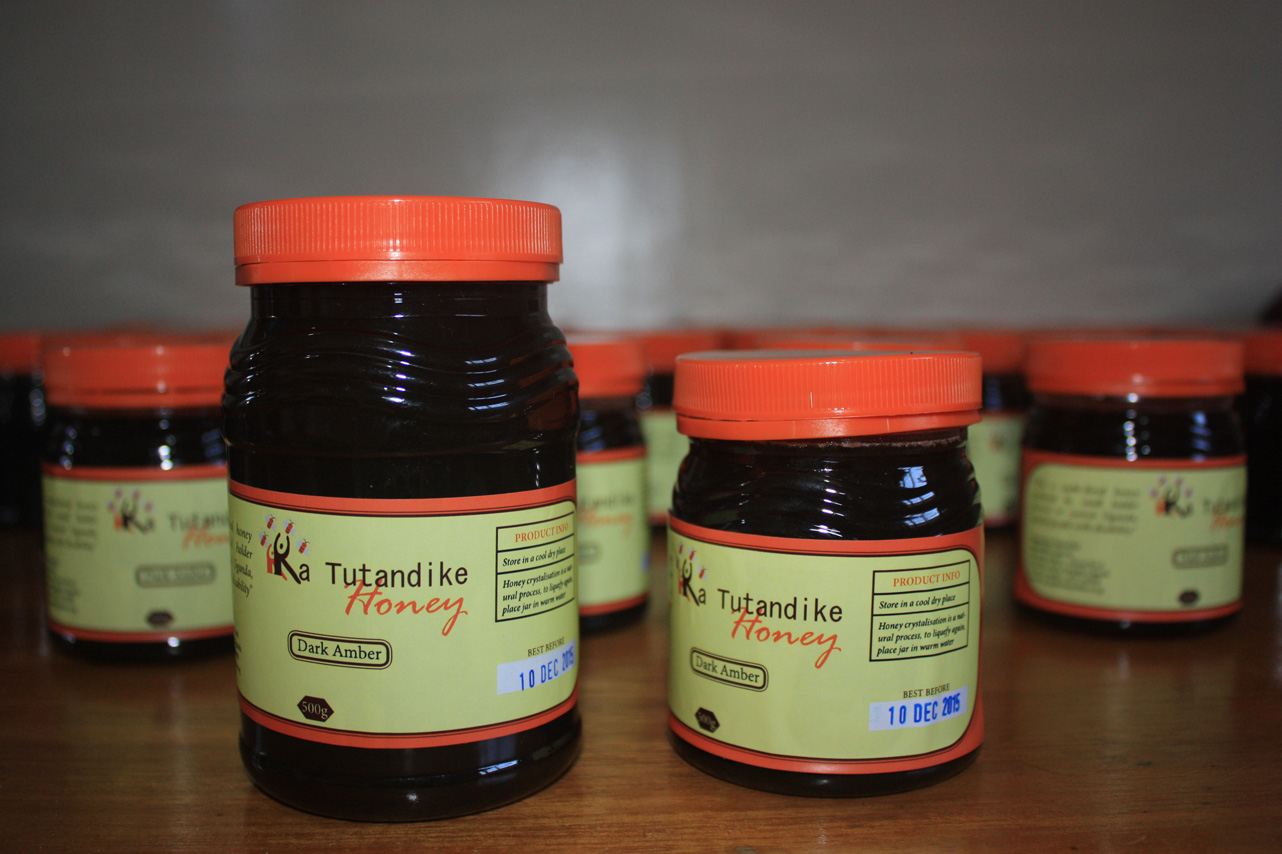
There were two flavour variants of honey – dark and light Amber which are sold in 300g and 500g jars. We helped to differentiate the two flavours through colour coding on the tamper proof seal. With the help of copywriters we were able to bring the brand story to life. The labels and jars are printed and sourced in Africa.

What is the element of your work in the project which you are most proud of?

This was a great meeting of minds and experiences from the client, packaging design co-coordinator, copywriters and designer. Everyone really put their heart into this project. By improving Katu’s packaging design I am very proud to have helped this great product get the recognition it deserves.


What was the most difficult compromise?

Budgets and sourcing considerations meant that the original jar was made from plastic with the standard bright yellow lid. In the short term we have suggested changing the colour of the lid to custom green lid so it will feel more natural and organic. Ka tutandike are working towards hopefully changing to a better quality glass jar in the future, which will be better for the environment too! There were also some cultural differences when it came to the copy. Certain text that would resonate well here would not resonate well there and vice versa; therefore, creating copy that would be attractive in both locales was a difficult task.

Thanks to Laura for the above and really looking forward to hearing from her on the day. More information on Outstanding By Design including full line up and a link to booking here.

Keith

Gubbeen, Fingal Ferguson, Lorenzo Tonti and an enduring brand

Once upon a time a graphic designer based in Waterford/Kilkenny decided to help found the South-East’s first Slow Food Convivium and, because he was good that way, he also helped out the national Slow Food group with their website and design.

During that time Lorenzo met with the founder of Gubbeen, Giana Ferguson and that is how his long association with the brand and their packaging kicked off.

On 10th May Lorenzo and Fingal Ferguson (Giana’s son) will be kicking off the day and they will start with that initial piece of work by Lorenzo:

Q – What was the initial scope of the work?

A – Brief (if I remember correctly, we’ve been collaborating since around 2001/2) was to redesign the brand, make it ore lively and fresh – that included the ‘logo’ and packaging. The project evolved into what we have today, more and diverse products and applications. It was my intention from the start to create a long-standing brand which could grow with the business.

Q – What are you most proud of within the work?

A – The flexibility, longevity and overall feel of the brand. It hasn’t grown tired. Plus, the relationship between client and designer: one of the most fulfilling I’ve ever had.

Q – any particular compromises that stick out for you?

A – I don’t think any of us compromised. Not in the products, not in the design. We found a balanced way of working which suited the creative minds of makers and designer, and that’s what makes the partnership successful.

Sounds like a great one to start with – there is a lot to be learned from that relationship and the enduring strength of the brand.

More information on Outstanding By Design including full line up and a link to booking here.

Keith


Joe Fitzmaurice on starters, ovens and workshops #realbread

Been sitting on this & finally got around to a rough edit. Alec Taylor kindly shot some post event video at Meet The Bakers capturing Joe, Josephine and Declan chatting to the audience.

This piece is a couple of segments of Joe Fitzmaurice.

Enjoy 🙂

Next one up is Meet the Cheese Makers on 5th April.

Keith

Meet The Cheese Makers – Helen Finnegan

Helen is the local representative in this Meet The Cheese Makers event on 5th April and what a great one to have with her award winning goats cheese.

The extra special Ardkeen Stores in Waterford put up this video of Helen so thanks guys 🙂


More information and booking here.

Keith

Meet The Cheese Makers – Siobhan Ni Ghairbhith

Siobhan is one of the 3 cheese makers we will be chatting with on April 5th.

St Tola won the Supreme Champion award for Irish farmhouse cheeses at Bloom in June 2013 and in the video below shot on the day she shares the story of her cheese.

Keith