Irish Artisan Drinkmaker’s Association

This tweet caught my eye today – it was put out by Cornelius Traas twitter.com/theapplefarmer

Any beverage makers out there interested in starting an association? Irish Artisan Drinkmakers Association? Contact me if interested.

So that is interesting – and no better man that Cornelius to get it started, even as a foodie I am aware of the amazing reputation he has amongst his peers. Go check out his website and if you are in the business send him an email.

Have suggested to him that it might be useful for him to grab a speaking slot during Foodcamp and explore it there. Will keep updated on that 🙂

Keith

Guest Post – Bacon Jam, Ed Hicks

With a number of guest posts in the pipeline Liz Maybury (who featured in May with her Mella Fudge work) popped into my inbox again yesterday so here she is – thanks Liz.

This came about via a quick chat with Ed at the Taste Council event in Wicklow which was the first time we had spoken properly and when he happily told me who had done the design for him.

This is Elizabeth

and this is her second guest post:

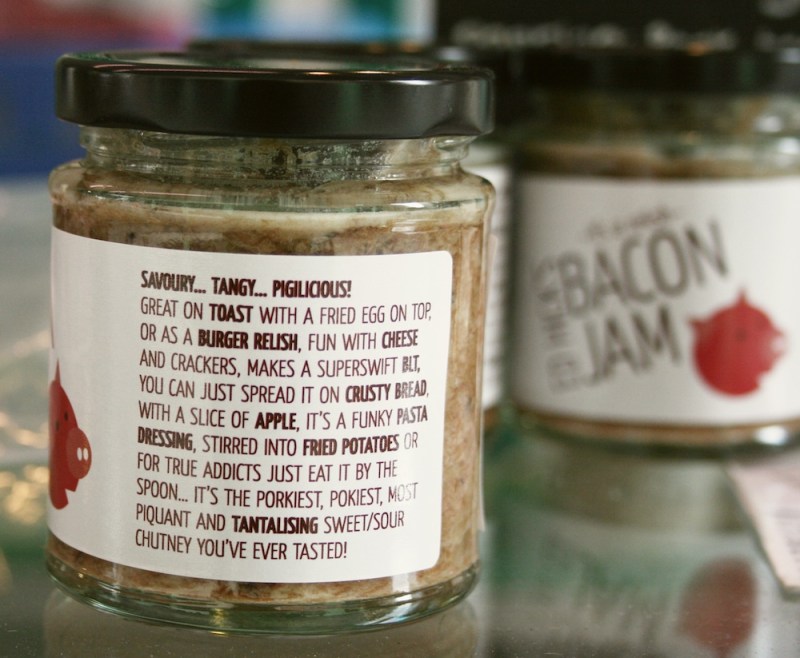
Bacon jam is “the porkiest, pokiest, tangiest, most tantalizing sweet/sour chutney you’ve ever tasted” created by Ed Hick of Hick’s Traditional Pork Butchers in Dun Laoghaire. It can be used as a relish, on eggs, stirred in as a dressing, spread on a sandwich, or even eaten by the spoonful. Ed gave me the task of designing a label for his creation, which, being a bacon jam fan, I was only too happy to accept!

The brief for the design was fairly open, so I came up with several concepts to present to Ed before we settled on the chosen idea. It wasn’t a requirement to match the label to the existing Hick’s branding, but the little pig illustration alludes to it.

I drew the pig using simple geometric shapes. The typography is set at an angle to continue the geometric theme. I chose a soft and friendly typeface as a contrast to ensure that the whole design didn’t look too angular and severe in combination with the capitals of the text and the straight lines of the illustration.

The descriptive words in the product information are bold to highlight and bring some points of interest to what would otherwise have been just a large block of text. The size of the label was also important, as if it’s too long it gets difficult to wrap around the jars, so this also had to be considered.

As a result the most challenging aspect was fitting in the nutritional information, ingredients, best before, batch number and barcode into a small area without compromising legibility. I left a space beneath the best before and batch numbers where the information can be overprinted during production, as these figures aren’t constant.

The label is self adhesive and printed on a gloss stock. It comes in rolls, which can then be run through another printer to overprint the appropriate best before and batch numbers before they are finally applied to the jars.

Bacon Jam is available from Ed at Hick’s stall in Temple Bar Food Market every Saturday and from Sheridan’s Cheesemongers.

www.hicks.ie
Facebook: http://on.fb.me/ehlZar
Twitter: @edhick

http://lizmaybury.blogspot.com

www.elizabethmaybury.com
Twitter: @lizmaybury

Thank again Liz. You can see the other posts in this Food Brand Design Guest Post series here.

Keith

Guest Post: Tom Crean Lager, Dingle Brewing Company

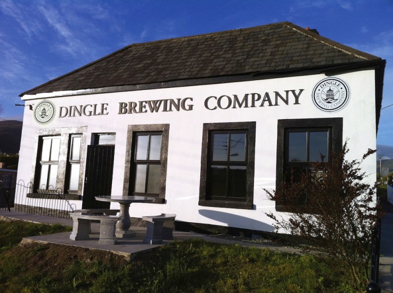
While I was in Dingle last weekend as part of the Dingle Food Festival I got to visit the newly opened Dingle Brewing Company whose single brew – the Tom Crean lager – is already being brewed at full capacity despite only being launched in July. The brand and its application across a variety of media is really impressive.

What follows is the story of that brand development by MidPoint Creative in Tralee – written by Steven Ruane. It is long and comprehensive so thanks to Steven for taking the time to share it.

History of Client:

As a start-up this company had no history as such

Initial Brand Status:

We met with the owners of the Dingle Brewing Company at the very start of the project. They informed us of their plans regarding the product, the premises for their business and their business plan.
Objectives of the client:
On meeting the directors of the Dingle Brewing Company we soon discovered that they had a very clear vision. They wanted to produce a premium lager that would appeal to a wide market. One product made right. They wanted their product to be truly Irish and for the Irish. The pub trade in Ireland has been suffering for a number of years and they wanted to produce a product that would bring people back to their local pubs, a product that would be enjoyed in good company and in the warm friendly atmosphere of the local.

They made it clear to us that they were going to produce the product naturally, using only the finest ingredients and with the minimum intervention in the brewing process. They had acquired a premises in which to brew, a premises which was full of character and history and which would fit in perfectly with their values and vision.

Scope of Project:

Create and develop brand identities and supporting material for the overall business and related product(s).

Carrying out research into the brewing and craft beer industry was a big challenge but one we were prepared to make the sacrifice for. Purely for research purposes we had to spend a lot of time in bars. We spent a lot of time staring at beer mats, beer taps, different brand marqs and imagery used in other breweries. We also asked the opinion of bar workers. As the product was going to be only available in bars it was vital that we got their insights into independent breweries and how their customers reacted to same.
Brand Marq Design

At our first meeting we had a long discussion with MD of the Dingle Brewing Company, Jerry O’Sullivan. On that first meeting we also got a tour of the site, ‘site’ being the operative word. We were shown around what used to be the Dingle Creamery building by Jerry. During the site visit, Jerry explained to us his plans for the business and the premises. It was very clear from listening to him speak that he had a crystal clear vision for the project. From a brand building point of view this is the best foundation you could hope for – a strong clear vision. On leaving the site that day we had no doubt that if we could express that vision in a creative way that this would be an extremely interesting project.

With this initial stance we prepared a brand platform document outlining the vision for the venture and setting down the foundations for how we were going to portray and develop this, both strategically and creatively.

As well as this we spend time online researching the brands that had been identified by the stake holders as competitors and benchmarks. We also had the very welcome opportunity to spend a lot of time in Dingle, soaking up the atmosphere and environment of where the brewery would be based

Putting together and distilling all of the information we had gathered on the brewery we were left with the following key impressions

Adding this to the other general research we had done on how other brands visually present themselves we got busy sketching. The image of the brewery building, being situated as it is, at the foot of the Conor Pass in Dingle was hard to escape. Other striking aspects of the brewery were the rich, dark wood casks that were part of the brewing kit and the sound of babbling water for the stream which flowed at the side of the brewery building. These images seemed to encapsulated the feel of the brewery.

The brand marq is made up of representative imagery. The client liked this and felt it fit in better with the ethos and feeling of the brewery. We used simple representations of the major features of the brewery, mainly the landscape and the brewing cask. We wanted to give the overall impression that this was Dingle itself being passed through the brewery and brought, via the lager, to the end customer. We kept the imagery simple and uncomplicated to reflect how the Dingle Brewing Company intended brewing. We also had to keep in mind that this brand marq was going to be scaled up and down for use on everything from large outdoor signage to small merchandise items. With one or two small adjustments the client was happy with the brand marq.

Support Material

With the brand marq signed-off we started working on developing he identity. As mentioned one of the memorable images we had of the brewery was the dark wood that the casks were made of and which was accented as part of the brewery building itself. We decided to use an image of this wood as a backdrop for the brand marq and as a background for the associated marketing material. It worked well with the darkness of the wood providing a good contrast against the mainly white brand marq. It also gave a good indication of the atmosphere of the brewery for those who would see the material without having visited the brewery.

We also got to work on other supporting material, from outdoor and ambient signage to flyers and brochures right across the board to t-shirts and other merchandise that would be available in the brewery gift shop.

At the moment we are just finalising the web site design and hope to have this online in a couple of weeks. We, and more importantly, the client, are very happy with how it is shaping up and are looking forward to seeing the reaction it gets from users.

Product Branding

The guys at the brewery had a very simple business plan. Instead of going fo a range of products they were going to produce one product and put all effort and concentration into making that product a premium one. They had decided to brew a lager and they were going to name it after local hero, Tom Crean. We were delighted with this name. Through his many feats of bravery and endurance Tom Crean had reached almost mythical status. The fact that he was from nearby Annascaul, Co. Kerry gave the name all the more relevance and resonance. We felt that there would be great creative scope here to create a really memorable identity for the lager and the supporting material.

Tom Crean’s Premium Irish Lager
The Dingle Brewing Company wanted an image that would reflect the care and effort they were putting into getting the lager just right. They also have a great deal of respect fro Tom Crean, the man, and wanted this respected to shine through in the identity.

We set about researching the man. There was so much to this quiet, stoic, character who went from the village of Annascaul to being a valued member of expedition teams for both Scott and Shakleton and ended up being heralded as having carried out the greatest feat of human endurance. After his naval career he quietly retired to his home village where he owned and ran the South Pole in until his death in 1938.

There was a lot we could have worked with but sticking to the ethos of the brewery and the character of the man himself we wanted to make the identity simple, uncomplicated, understated and interesting.

We had thought about a hexagonal shape for the identity, based on the shape of the Polar Medal, 3 of which were awarded to Tom Crean for his various feats. We had not seen many bar taps or identities of this shape and thought it would be a nice way to honour the hero.

As a second option we thought of an explorers compass. The circular shape of a compass also sat well with the brand marq for the brewery.

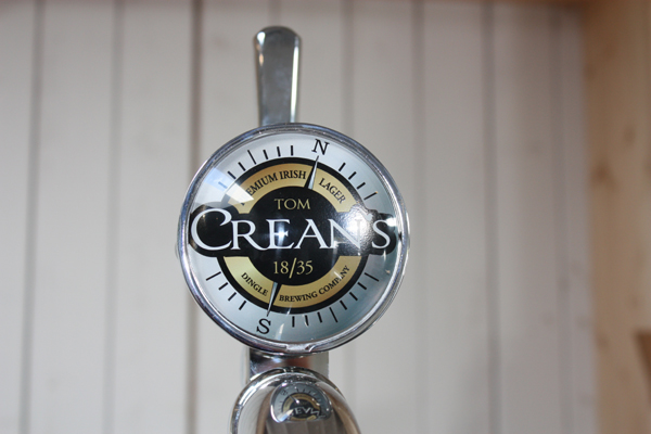
After discussions with the client we developed the ‘compass’ option. What could be more evocative of discovery and exploration?. We went through many versions of a compass graphic, some too complicated, some too modern. We eventually settled on a very simple version with only the North and South points showing. We placed the compass slightly off centre in a nod to a ships chronometer and to give the feeling the the needle was moving back and forth.

For the name of the lager we wanted to accentuate ‘Crean’s’ It was the vision of the Dingle Brewing Company that the customer would walk in to the bar, nod a t the barman and ask for ‘a pint of Crean’s’ To this end we made ‘Crean’s’ the focus of the identity, with the first name Tom resting in smaller type on top. For the typeface we wanted to used an old fashioned, classic looking, serif font, as would have been seen in newspapers and posters of the time. we felt that using all uppercase letters spoke to the strength and unwielding nature of Tom Crean.

Once we had the main elements decided on we added some distinctive character elements. On reading accounts of Tom Crean there were many comments on how he never asked for much and how much he would enjoy his pipe. We wanted to incorporate this in some way and after playing around with it for a while we used a pipe graphic as the apostrophe in Crean’s.

Another little fun item we added is the 18/35. This has already proved to be a great conversation starter when people see the identity or as they are holding the glass. Was it the year he was born/died? Was it the year of any of his voyages or the year he retired?. In Antarctic conditions and surviving only on 2 sticks of chocolate Tom Crean set of on a 18 hour trek over 35 km, a feat of incredible endurance and all to save the life of his 2 colleagues. We had to mark this in some way, so without much fuss or fanfare we nestled the numbers under his name. It still gives us a kick to see people noticing the number for the first time a theorising about what they mean.

For the colour palette, with the imagery of medals being in our minds we stuck to silvers and golds. We felt these also added to the premium feel that the client was hoping to achieve.

Support Material

Once we had the 2 identities finished we set to work on all manner of support material. Beer mats, bar taps, exterior signage, flyers, tent cards, posters, t-shirts, merchandise, web and social media, even right down to working with the clients on choosing and branding the glass.

Tagline and ‘Footprint’

For the supporting material we need a strong but engaging tagline. Given the provenance of the name of the lager and all that entailed coupled with the entrepreneurial spirit of the guys in the brewery we settled on ‘Discover Crean’s’. Simple and effective, it evokes the imagery associated with exploration while letting people know that this is a new lager worthy of discovery.

We also need a primary image to accompany this tagline on the marketing material. Given Tom’s amazing trek, we decided on using a footprint in the snow. The client was very happy with the footprint image. in one simple image it evokes the mammoth task which Tom crean undertook. The bleakness of the footprint in the snow contrasts nicely with the warm hue of the lager.

it all came together for us when the lager officially launched. The Dingle Brewing Company were aiming for the first brew to be ready mid July and it was. As if fated, Tom Creans birthday is on the 21st of July so after putting our heads together with the client we decided that the only place in the world that this lager should be launched is in the South Pole Inn Annascaul. So on 21st of July 2011 the first pint of tom Crean’s premium Irish lager was poured from the taps in the South Pole Inn, once owned by the great man himself, and the time of the first pour.. well that was twenty five to seven of course i.e 18.35.

Thanks for that Steven. You can see the other posts in this Food Brand Design Guest Post series here.

Keith
Guest Post – the evolution of Cathy’s Spelt For Health packaging

The 5th in this series is written by Cathy Whitty, one of the 2 owners of this brand. Happily Spelt for Health won a Joint Gold in the Cake & Breads Mix category at the Blas na hEireann awards last night – adding another to their shelf of awards which also contains a two star Gold Great Taste Award.

Here is Cathy’s post:

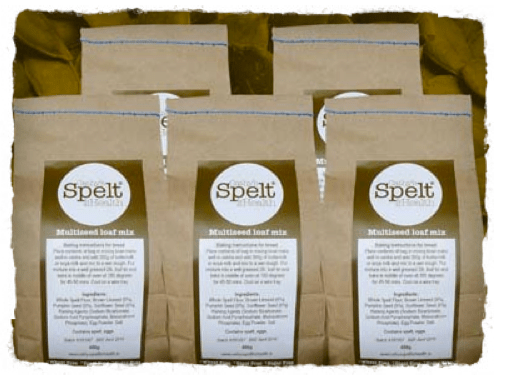
We are in business just two years and if we are to continue we needed to take it up a notch. Our old bags were brown paper with a label back and front.

The same great graphic designer has been involved with us from day one and designed and manages our website. Catherine Murray is a completing her degree at the moment. The brown bags were great in the beginning as we didn’t have to order in huge volumes and we could order labels in small batches so it was easier to manage cashflow.

However the downside was the labelling by hand very time consuming; it took an hour to label 100 bags so as our orders started to grow it was just impractical. Also as our flapjacks contain coconut it left little oily stains on the bags.

So once we knew there was enough demand the time had come to get new packaging. We were luck to have a mentor, Lisa Cunningham of Vogue Business Development assigned to us by Wicklow County Enterprise Board.

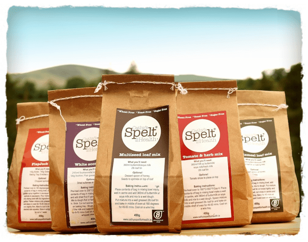
Lisa looked at our products range, five products, five colour ranges. We were so nervous about going so colourful after our brown bags which we felt were earthy and natural looking. Cathy our graphic designer did several mock ups of different colour schemes, different layouts however the most important thing was that  they all had to complement each other on a shelf.

We had one overall colour and then chose a ten per cent gradient of that colour for the panels which contained writing on each bag. The guaranteed Irish logo is on the back of the bag and we put a photo of Cathy also in a circle so people could identify a person with the brand. (note from Keith – will check this with Cathy as that photo is not evident in this shots!)

Photography
Next up was the photograph which is on the front panel of the bag. We are a start up company and on a shoe string budget so we were left to take the photos ourselves. This part was the most frustrating, trying to get the photo just right. We used the surrounding landscape as our backdrop to all the photos. It took many many attempts until eventually we agreed on the photos.

Legislation and food packaging

We though we were ready to print, the design had been finalised, bags proof read and we decided to check that what we were writing on the actual bags complied with the current food safety legislation. The food safety authority were so helpful and read all our labels and it turned out we had to delete so much text from the bags. This could have been a very very costly mistake. A word of warning is get your packaging approved before you print!. Our new bags now comply with EU legislation and we are ready to start exporting in the coming months.

The one day workshop which will be run by Teagasc on October 18th ‘Package your Way to New Markets’ would be well worth attending and could save a lot of headaches if you are redesigning or rebranding your existing packaging!

Thank you for taking the time to share that Cathy – much appreciated.

Her website again: www.cathysspeltforhealth.ie

And on twitter: CathysSpelt

Keith

You can see the other posts in this series here.

Some fun with the winners – Blas Na hEireann 2011

I really enjoyed my attendance (for the first time) at the Blas awards last night in Dingle.

While I was live tweeting on the night and so making the winners available as they happened there is a full and accurate list up on the Blas website here.

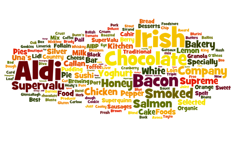
For the fun of it I took the text from that page, stripped out repeated phrases like Gold, Silver etc and ran it through Wordle. This is what it produced:

Conclusions from that (with the most frequently used words in largest font sizes):

* Chocolate and Bacon are two favorites in Ireland and we like our food Smoked.

* Aldi dominated these awards from the multiples perspective with Supervalu coming in second.

If you click on the image it will bring you through to a larger version on the Wordle site.

keith

Gookies & Pure @SHOP

20110927-172357.jpg

20110927-172406.jpg

So after a short meeting at the SHOP exhibition I had time for a quick look around and came across 2 newly launched artisan products & packaging 😉

Gookies started in the food service sector and are now moving into consumer facing products. This packaging is still a work in progress – they are using SHOP to gather feedback. The colour band differentiating flavours needs some work.
I liked it – clean and strong. I will do a follow up post once we have tried one of their products 😉

And Pure Sushi who hale from Kinsale – clean, contemporary Irish feel to their logo with just a hint of shamrock/Celtic.

I have asked for guest posts from both designers so hopefully, Eric who did 8 Degrees is the Gookies culprit.

Keith

Irish winners in the British Cheese Awards 23rd Sept 2011

A number of Irish farmhouse Cheese brands did really well in these awards – The British Cheese Awards which were announced yesterday in Cardiff).

Knockdrinna Farmhouse Cheese

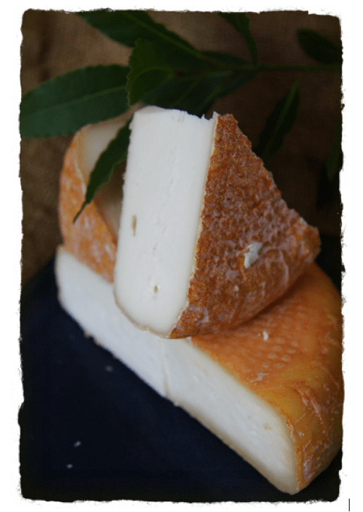
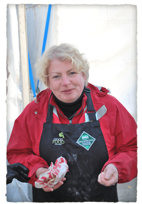
This one was special – it was the Top Dog 🙂 The Kilkree cheese from Knockdrinna scooped the Supreme Champion overall award as well as the Best Irish and Best Semi-Soft. Its produced here in Kilkenny by Helen Finnegan and her team.

This is Helen at the Savour Kilkenny food festival 2010. I have known Helen for years and she is passionate, hard working and supportive of her fellow producers. Well deserved.

Meanwhile best Goat Cheese was won by the Galway based Killeen Farmhouse Cheese.

Great to see artisan food producers from Ireland consistently winning overseas – says so much for the strength of this sector in Ireland

Keith

2 Kilkenny artisan food businesses share Joint National Organic Award

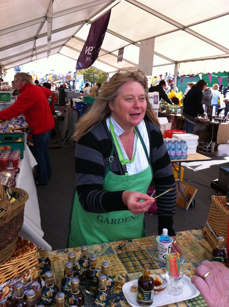
Just had a call from a delighted Julie Calder-Pott (Highbank Orchard Syrup) who told me that herself and Kitty Colchester (Second Nature Oil) have just won a joint Best Grocery Product Award in the Bord Bia National Organic Awards which were announced today.

Julie at the Amazing Grazing event in Waterford yesterday

Kitty at the same event

A worthy runner up in the same category was Pat Lawlor of Kilbeggan Organic Porridge fame.

You can see Pat in a recent post here.

Great news for the Klkenny duo :-). Congrats all

Keith

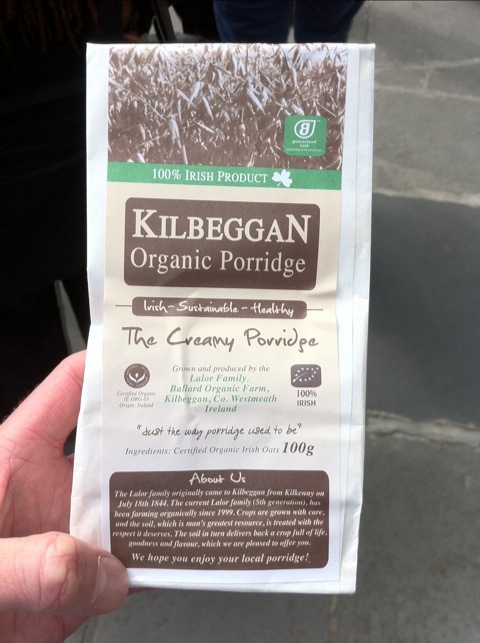
Kilbeggan Organic Porridge – packaging update

Pat Lawlor was at the GIY Gathering event I went to yesterday and I took the opportunity to say hello afterwards as a fan of his product.

He had some sample packs with him (I took 4 and gave them out during the Amazing Grazing event on the Quay) and he talked me through the changes in V2.

Based on feedback from retailers HR has stressed his Irishness. So the addition of 2 very visible Irish elements at the top and his address under the Creamy strapline is also in green.

And a more subtle change too. Kilbeggan is now in the font used on the Kilbeggan whisky labeling. Pat asked for and got permission to do so.

Now two consumer facing food products from the same area share a strong common visual feature. You have to love the way this oats farmer thinks, I do 😉

Keith

20110912-070009.jpg

20110912-070018.jpg

Enterprising Food Conference – Nicholas Dunne, Killowen Farm Yogurt

My third post from this conference held as part of the Harvest Festival in Waterford. Here are the first (Peelham Farm) and second (M&D Bakery).

Killowen Farm Yogurt: They took over Killowen Dairy from orginal producers. 3 of them (friends) took over and lost a pile of money over 12 months. Mentor came in (Wexford CEB appointed) and suggested trimming the team (out went the 2). He also took advice from a friend of his who ran an ice cream company.

So the friend sat down with them and asked them “Are you out of your heads?” – he kept it up for an hour just to make sure they were serious! They put in better processes and tried for 1 day manufacturing, 1 day packaging and it took them a couple of months to do that.

They consolidated the business and moved it back to their dairy farm (which was 8 miles away). From there they started to do some market research and then sold into new local stockists.
They then got a listing with Pallas Food via a Speciality Foods fair (Bord Bia run) in Dublin and that moved them into volume and then the food service area. Food service is now 30% of their business.
They supply into a number of local hotels with the blessing of Pallas Foods so they retain the direct relationship with chefs whose feedback is blunt, immediate and vital 🙂

He touched on HACCP – they got away with murder early on but now are completely compliant so they can trace back for each batch where the raw ingredients came from. He said this is crucial for working with new buyers.

He again said that the assistance of Wexford CEB vital to them.

Awards – these reflect their emphasis on pure ingredients. Great Taste awards, Blas na hEireann (Gold medal) and JFC Innovation awards – most innovative food company. (a 3 star great taste award and 10 1 star awards).

Funding – initially Leader and then Wexford CEB helped with an owners managers course and assisted with their website. They also use on average at least 2 mentors a year. Going forward they hope to approach Enterprise Ireland for assistance.

They backload via Pallas Foods.

Packaging. New packaging launched in the last weeks. It took months and months and was shortened via Bord Bia Vantage programme.

They do about 40% private label – Superquinn glass jar and also Aldi. He sees this as helping their growth and also lifts their standards a lot.

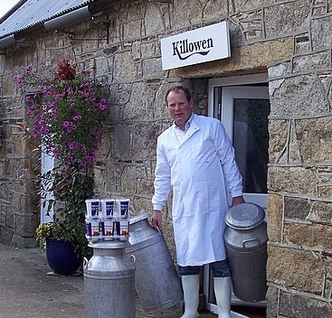
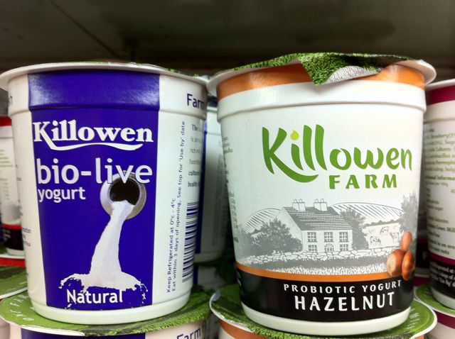
Above photo from my previous post on their redesign. Thanks to Nicholas – that was a frank and enjoyable presentation which I am sure many food producers will appreciate and learn from.

Keith