Outstanding By Design – Photos, Videos and Audio @anygivenfood

In the world of well resourced events everyone has a media partner – usually one of the national newspapers or a national radio station. I have/had my good mate Ken McGuire who wears his AnyGivenFood hat for such stuff.

On 12th May he took photos – sample underneath and full post here.

Screenshot 2014-05-18 16.31.58 Screenshot 2014-05-18 16.32.35 Screenshot 2014-05-18 16.32.44

He shot video and is slowly splitting out the audio tracks so that you can listen to the full day on podcasts.

First one of Sarah and Paddy can be listened to at this link here.  The second with Giles Calver is on this link here.  The full AnyGivenFood podcast series covering Biabeag and a lot more can be subscribed via the links in his post here.

Finally the videos are being put up on Youtube and the first two are embedded below.

I’ll post further videos as they are edited and uploaded – thanks Ken 🙂

Keith

Outstanding By Design – Guest Post by Theresa Phelan (@ 3sa23)

Coming up to Outstanding I was contacted by Theresa Phelan (link to her Linkedin Profile) who lives in Kilkenny. She did Visual Comms in Limerick and heard about the day during a work placement with Brand Union.

She helped me out during the day and wrote this guest post on each of the talks. I enjoyed her take on each of the talks and the day overall -thanks 🙂

Keith

_________________________________________________

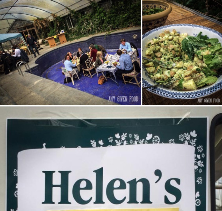
Outstanding by Design, took place on the 10th of May and explored the beneficial outcomes of great branding and design on food producers sales. The one day event of inspirational discussion, happened in the beautiful surroundings of Highbank Orchards, located on the outskirts of medieval Kilkenny.

The itinerary for the day scheduled 7 Irish designers to speak with their partner food producing client, about collaborating and developing their successful branding and packaging. Outstanding by Design was not limited to insightful and inspiring presentations, but also held 1 to 1 consultations between attendees and designers. The atmosphere was light and relaxed with a wide range of attendees from local entrepreneurs to passionate designers.

Sarah Maguire, Brand Union & Paddy O’Connell, Paddy O’Granola

The day kicked off with Sarah Maguire from Brand Union, discussing her role in constructing the branding and packaging designs for Paddy O’s Granola. Paddy O’Connell is the owner and producer of Paddy O’s Granola and holds the ambition of becoming the leading granola seller in the UK.

The choice to rebrand was also driven by his desire to heighten his on-shelf visibility within supplier outlets. Sarah strived to portray the product as being fun and wholesome by placing Paddy’s own personal story at the heart of the brand. Sarah described the different visual assets used in order to communicate the brand essence ‘getting the most out of life’.

One area of design which particularly stood out was the inclusion of intricate map illustrations on the packaging, which provides the consumer with a personal experience and builds consumer engagement with the brand. Paddy pointed out that it is quite expensive to rebrand, yet it is definitely an essential key to progressing a brand. In regard to the success of the rebrand, sales grew by over 300% with the product being sold in large retailers including Tesco, SuperValu, Dunnes Stores, Palas Foods and Avoca.

Laura Macaulay, Navigate By Design & Ka Tutandike

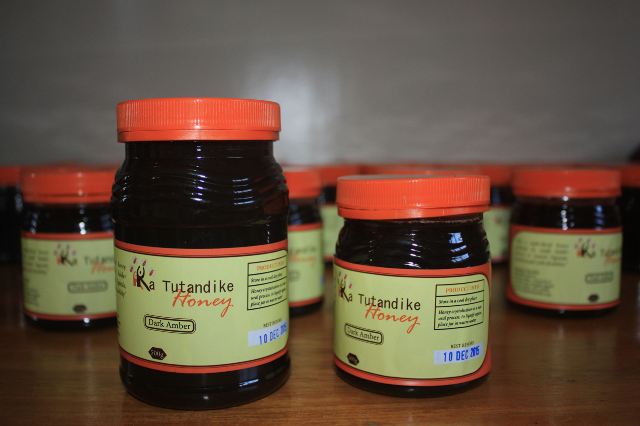
The second discussion of the day reflected on the success of Ugandan Katu Honey collaborating with designer Laura Macaulay and Kristina Moody from non-profit organisation, Value-Added in Africa. Kristina discussed the Value Added Africa model which explores the plan, concept, research, copy, design and produce.

The Ka Tutandike ‘Lets Get Started’ charity is based in Uganda and decided upon selling honey due to its accessible production and high demand from a consumers point of view. Laura Macaulay from Navigate by Design looked at rebranding the existing identity of Katu Honey by choosing to portray women empowered as the underlying brand concept. Tying in the idea of women harnessing the power of nature in their back garden to produce quality food gave way for a strongly ethical piece of design.

Kristina discussed the process of survey evaluation on the product which took place on survey monkey prior to the products launch. This allowed for feedback from consumers which helped exam the designs created for the brand thus creating a solid structured finalised brand. Other points given during the talk included the necessity of creating a compelling brand story, hiring a copywriter can strengthen a products design, develop strong working relationships with everyone on board the project and to market with broad brush strokes.

Erik Johansson, The Green Man Studio & Paul O Connor, Trouble Brewing

The third talk was by Trouble Brewing who originated in 2010 and has been producing beer for nearly 4 years. Paul O’Connor is a partner in Trouble Brewing and began the discussion about the different variations of beers they are marketing and producing within their Kildare based brewery. They decided upon a name that wasn’t typical Irish for standout amongst similar produce sellers while their approach to design is quite unusual for differentiation in their point of sale. 

The craft beer industry allows for great exploration in ingredients and alcohol levels which ultimately allows for creative branding. Erik spoke about the given brief for the redesign of the existing brand identity which aimed to be rebellious yet not offensive. The design was inspired by cartoon comic strips to get a story across to the consumer.

Erik looked at humour to portray a contemporary feel to the brand, resulting to a highly innovative piece of design with a controversial approach to brand identity. There is currently a large interest in the craft beer sector with Trouble Brewing’s sales growing almost 50% every year of their existence.

Liz Maybury & Mella McAuley, Mella Fudge

Mella McAuley grew up producing fudge in the locality of Clonakilty in Co.Cork. Mella’s passion for making fudge expanded into a large scale project which currently markets in a variety of artisanal stockists including; Avoca, Butlers Pantry, Selfridges and SuperValu.

Liz Maybury is a young passionate designer who took on the task of creating Mella’s Fudge brand identity and packaging. Liz firstly spoke about her own design process and how she believes in meeting the client in person to discuss their brand belief and to gain insight into what the client requires.

Mella had one criteria for the design which was to include gold foil in the packaging design to evoke a sense of quality.Liz pointed out the importance of looking at different competitors on a national and international level to gain deep insight into the existing branding trends.

The Q & A section of this discussion gave rise to some interesting protocols needed to be considered when creating a brand which included registering a brand to become the full owner of a brand name. Liz also stated that when a client is choosing a designer, they need to research their portfolio and previous designs to ensure that their style is suitable to their product.

Steve Simpson & Mic Wejchert, Mic’s Chilli

The afternoon session of discussions began with renowned illustrator Steve Simpson speaking about his role in creating the branding packaging and identity for Mic’s Chilli. Mic was unfortunately absent for the talk yet Steve gave great insight into the alternative approach taken in producing the packaging and label design. Mic was drawn to the chilli industry after he became redundant. Mic wanted a design that is attractive on a table not just in the supermarket. The packaging acts as a piece of artwork on its own rather than a food product.

Mic got in touch with Steve to create a brand for his new product even though he is not a traditional graphic designer. Simpson’s background is based in comic book design and has designed for renowned brands such as Boyne Valley , Eddie Rocket and Panda.

Steve’s inspiration for Mic’s Chilli derived from day of the dead artwork. Hand lettering was a huge influence as Simpson wanted to incorporate a vintage feel into the packaging with a limited colour palette. A particular area of the package design which is intriguing is the development of a personalised barcode. Simpson cleverly created this barcode to sit with his design. Steve has a set of guidelines to stick to with barcodes on his website which may be usual for designers: http://stevesimpson.com/17721/1202053/portfolio/illustrated-barcodes

Mic’s chilli has gone on to win various awards including the Great Taste Awards and the ICAD Awards. The produce is currently being sold in SuperValu, Harvey Nichols, Avoca and many other stockists on an international scale.

Rachel Kerr, Creative Inc & Liz Skehan, Skoff

Skoff pies are a new range of premium branded Irish pies by Donal Skehan. The new product is only 6 weeks old and has already received great commendation from consumers. Donal’s mother Liz, worked in conjunction with Bord Bia who held 3 pitches with different design agencies in attaining the branding project for the new range. Liz required the brand to stand for home cooked food with a funky personality which ultimately reflects Donal’s own self. 

Rachel Kerr from Creative Inc took on the job of branding Skoff and spoke about her main ambition of getting the story of the client across through the packaging and branding. Creative Inc originated in 1995 and are primarily a branding company whom have worked with clients from public to private sector. A strong point Rachel made confirms ‘a good name is the gateway to be identified, recognised and understood’.

The name Skoff is an overarching and distinctive name that suggest wholesomeness while still linking Donal’s own name by replacing the c with k which links to Skehan. The design was influenced by 50s graphics with vibrant colours which undoubtedly grabs the consumers eye. Liz lastly spoke about the importance of the packaging format in terms of being stackable and sustainable. Skoff pies are currently being supplied in various stockists including SuperValu, Dunnes Stores and are currently in negotiation with Tesco.

Lorenzo Tonti & Fingal Ferguson, Gubeen

The penultimate discussion of the day was given by Fingal Ferguson from cheese producing company Gubeen and the brand designer Lorenzo Tonti. Fingal grew up on a family farm in West Cork and has been always creating exiting foods and holds a strong working relationship with Lorenzo.

Fingal spoke about the heritage of the family and the existence of the Gubeen Logo which is a piece of artwork owned by the family and was originally created by renowned typographer Eric Gill. Lorenzo furthered the discussion by stating the relevance of getting to know the client in order to reflect on the story of the producer to communicate to the consumer. Exploring the essence of the producer provides a rich identity for the brand.

Lorenzo felt Gubeen are a group of passionate and creative people with strong beliefs which needed to be communicated in the brand. They are also inventive in the sense of using up in season products. Gubeen act in a collaborative manner to provide the best end product. This notion lead to the highlighting point of the talk which reflected on the necessity of strong interaction in the development of new and innovative products. Lorenzo wanted to express the history of the family through the survival of the brand logo from the 70s.

Revitalising this brand mark as the current logotype was inevitable due to its rich essence. Gubeen revisited the brand wanting to extend their range to salami’s and smoked meets which required the design of new flexible packaging systems and colour schemes. Overall Lorenzo and Fingal’s discussion pinpointed the value of close relationships as they allow for ease of development of ideas. The range is constantly growing which keeps the brand contemporary thus business is always changing. The talk finished up with the term ‘chaordic’ which is a system that may appear unorganised from the exterior but has an underlying organised system, which reflects the creative working methods of Gubeen.

Giles Calver

The day came to a close with Giles Calver speaking about food packaging designs and examining the different traits of successful branding. Strong points to take into consideration included the advantage of communicating the provenance of local food producers in branding is huge. The quality of packaging is also crucial as its longevity will allow for the brand to last. Asserting a particular attitude and building a relationship with consumers can help strengthen sales. The visual style of a product is relevant in keeping a consistent and own-able brand.

Calver ended his insightful talk with an astonishing figure which stated that a barrel of oil is valued at the same price as a barrel of Coca-Cola. Branding is truly an essential part of business development and driving sales.

In review, the event was highly inspiring which gave real scope into the branding and packaging design industry for entrepreneurs, potential producers, designers and food lovers. The discussions evoked many topics of interest which informed my understanding of how a client and designer relationship can help strengthen a brand. It was great to see such creative energy combined with passionate business mindsets. This one day event has surely instigated great encouragement for food producers to become more aware and familiarised with their own branding and the process involved in building a successful business.

/end

Outstanding By Design – thank you

Phew. Full house, great presentations and attendees who learned loads.

IMG_7237

This is Sarah from Brand Union working through their creative process on the Paddy O rebrand and them individually below on winning advertising and consistent growth.

Next up were Laura Macaulay and Kristina Moody on Katu Honey and trade not aid.

Erik Johansson, Green Man Studio and Paul O’Connor of Trouble Brewing on voodoo dolls and not being sued by a multi-national

All that stood between us and lunch was fudge. Mella McAuley and Liz Maybury on V1 branding (disaster) and V2 which wasn’t

Its after lunch and Steve Simpson plays the role of client and illustrator (Mic of Chilli fame was unable to make it)

Skoffing, food service and a son who cooks from Liz Skehan and Rachel Kerr

A ten year relationship between designer and brand – Lozenzo Tonti and Fingal Ferguson

Finally Giles Calver rounded out with some observations based on his packaging collecting habit 🙂

So many thanks to each of the speakers – its a big ask for a full Saturday from each of them.

Ken McGuire shot video for the full day and right now he is editing and doing post production – big thanks Ken.

My brother David Bohanna and Theresa Phelan assisted on the day. Miriam Donohue helped with PR. Helen Costello did catering (yum).

And final shout out is to Julie and Rod Calder Potts. They are wonderful hosts and a joy to work with – genuine people. Biabeag events are as much them as me.

Loads more on the day coming up over the coming days and weeks.

Keith

Outstanding By Design – why are attendees booking?

Couple of blog posts between now and next Saturday’s Outstanding By Design featuring people and businesses who will be there on the day. So you get a sense of what is driving them.

Conor Mulhall, General Manager, The Little Milk Company

“Irish Organic Dairy producer The Little Milk Company confirmed that they were the winner of the Best Organic Cheese award at the 2013 British Cheese awards. The results of the 20th British Cheese Awards were announced on Friday night in a big top marquee on a quintessentially English village green in the heart of Cotswolds. During the Summer months they also won a silver for their newest cheese the Organic Caerphilly and they won a Bronze and the prestigious Gold award for their Organic Mild Cheddar, Croagh Patrick.

According to the Little Milk Company General Manager Conor Mulhall they were thrilled, “We entered the Irish awards back in June and won four awards and then to come to the International awards in our first year and win 4 awards including the Gold is just amazing. It is a testament to the quality of our farms, our milk and all the hard work our farmers and excellent cheese makers have put in to get the cheese right.” The cheese is now available through Paxton and Whitfield as the Guest Cheese for September, and many others. It is also available online at their website www.thelittlemilkcompany.ie. The company are also in discussion with several other retailers with a view to getting the product available nationwide over the coming weeks.

Croagh Patrick Mild Organic Cheddar is made with the farmers own 100% certified Irish organic milk. This is made made using pasteurised milk. It is made using a traditional recipe and the cheese is then hand-wrapped in cheesecloth and hand turned in their maturing rooms. The cheese has a creamy taste, with a subtle and long lasting flavor. Other cheeses The Little Milk Company produce include: Mount Brandon Caerphilly (2 months old), Sliabh na mBan mature (aged from 9-14 months) and Sliabh na mBan vintage (aged from 14 months up). They are all high in anti-oxidants and rich in omega 3. The mature and vintage are made from raw milk. They has been very well received at tastings and they the company have received orders from France Germany, the UK and Dubai.”

Edmund Hart, Marketing Manager, GoatsBridge Trout Farm

“We have recently re-launched our shop and as part of an incentive we are looking to roll out our ‘fish Friday’ promotion where customers who come to our shop on Fridays can avail of special promotions. We are also actively looking to hold smoking workshops and cookery demonstrations throughout the year, anyone interested in booking these or simply coming down to the farm for a tour should go to www.goatsbridgetrout.ie for more info.”

Screenshot 2014-05-04 12.27.12

Helen Meade, Marketing Manager, Killowen Farm

Here at Killowen Farm yogurt we find packaging is an area of great complexity. We make everything from 125g pots right up to 10 Litre buckets for hotel and catering and we also do a greek-style yogurt range in glass jars. I suppose up until now we have been working on a “needs must” basis and figuring out our packaging on our own. This has led to a rather fragmented looking range with some labels are multi-tasking a bit too much over a wide variety of packs.
We also need to look at ingredients and labelling from a legislative perspective as there are new EU directives around this area.
We also want to tell the story of the farm and show the quality of the product better.
With all this in mind we are now looking to improve our packaging portfolio and the workshop is an excellent opportunity to get an idea of how the agency/client relationship works. It’s really good timing for us.
Our-Team-DSCF9056 Screenshot 2014-05-04 12.29.36

Paul Broderick, General Manager, Pembroke Hotel

Its not just food producers! ” I have fairly good working knowledge of branding but currently in the process of tendering for the right designer to take our branding project to the next level. After making some wrong choices in the past, I want to ensure that I have the knowledge to write an effective brief to ensure we choose the right person for the Kilkenny Pembroke Hotel.”
Screenshot 2014-05-04 12.34.39
Look forward to meeting all of those and many more on Saturday 10th at Outstanding By Design – bringing food branding and packaging design to life 🙂
Keith

What is Packaging Design?

This book by Giles Calver, who is with us for the day during Outstanding By Design on 10th May,  is now a reference for design students in the UK. It is strongly visual while containing a lot of very useful guidance around the application of brand within packaging.

It is not specifically just for food but contains a lot of food case studies.

Some excerpts with my comments on same:

“..with the prominence of branding, packaging is often the living embodiment of a brand’s values and personality”

> Packaging is important – but only part of the overall picture. If you don’t have a good grasp of the core elements of your marketing messages and branding positioning your packaging won’t make much difference

“Packaging’s primary face….should engage with consumers, attracting attention, triggering consideration”

> Your Packaging has only one goal – to sell your product. The design – a combination of the visual elements and the text – should be rigidly focused on that.

“The central message refers to the main persuasive issues or arguments.. the peripheral message refers to all other tangential elements…”

> You will have difficult choices to make – deciding what are the key 1 or 2 reasons why a consumer purchases your product/brand and ditching the rest in the packaging design 3 is the absolute limit – this is already too many messages for a consumer to scan.

“a brand becomes a compound of tangible and intangible values, the latter being formed in consumers minds it is very important to define your intangible values…packaging design can..portray these..”

> If you are a start-up your brand has no heritage so consumers start from scratch in sub-consciously deciding what the brand stands for. They will take a lot of their cues from the packaging and if you get it wrong your brand will suffer and you will loose control even faster

Giles will be with us for the full day during Outstanding By Design on 10th May and he will be available for 1 to 1 meet ups.

More information including the full line up and booking here.

Keith

Outstanding By Design – look at the range of design experience in the room :-)

The individual designers, larger companies and agencies who are on stage on 10th May have worked with the following food producers, restaurants and other food companies:

  • Bo Bristle
  • Donnelly
  • Pop Noodle
  • Saba
  • Pure Brazen
  • Skoff Pies
  • Total Produce
  • Finches
  • Glenilen
  • Cully & Sully
  • Dee’s
  • Rachel Allen
  • Paddy O’Granola
  • Galtee
  • King Gold Standard
  • Hodgins Craft Butcher
  • Country Kitchens Bakery
  • 8 Degrees
  • Firehouse Bakery
  • Gubeen
  • Mic’s Chilli
  • Fade St
  • Ed Hicks Bacon Jam
  • Mella Fudge
  • Dunnes Soups
  • Indulge Chocolates
  • Kerry Foods
  • Shellfish Ireland
  • Chilly Moo
  • Follain Preserves
  • Cavistons
  • Johnnie Walker
  • Cadbury Cocoa House
  • Tanqueray
  • Gordon’s
  • Windsor Diamond Jubilee
  • Chivas Brothers

That is an amazing array of design talent which each attendee will have access to and it is not comprehensive by any means!

Click here for more information.

Keith

Outstanding By Design – Skoff Pies

This one will be interesting, a food service company moving out of the shadows via own label production with a new and strong consumer brand.

Liz Skehan will share the story of her collaboration with Creative Inc on 12th May at Outstanding By Design but to whet your appetite here is a summary from Creative and a couple of behind the scenes shots taken during the process.

As you can see there is an understandable emphasis on Donal in the public face of this business but the role of Liz and her husband will be interesting to reveal.

Working closely with Donal and the Skehan family, it was important for us that his personality and love of all things retro was reflected in the new identity and packaging. The typography and stark graphic teeth are a playful homage to the works of iconic American designers such as Roy Kuhlman and Paul Rand.”

For more information on the day click here.

Keith

Paddy O’Connell and his @paddyosgranola brand

This is the latest post featuring the brand and packaging designs which will be discussed on 10th May at Outstanding By Design.

I first met Paddy at the Waterford Harvest Festival in 2010 – you can see him and the first packaging below!

Waterford Harvest Festival - Ireland

Since then the business has grown in leaps and bounds and he commissioned Brand Union to do a full piece of work on the overall visual identity and his packaging. This is what Sarah Maguire had to say about the work they did:

We were excited to meet Paddy for the first time. We had of course heard his story; college graduate starts making his own granola in a room above his parent’s pub and selling it at local farmers markets. In a short space of time, he found himself with a thriving small business, and Paddy O’s Granola was born.

When Paddy came in to chat with us, it became very clear how this guy had achieved so much in just a few years. His enthusiasm, energy and passion filled our meeting room. As we got to know Paddy we could see that these traits were not limited to his business approach. It’s his way of life, and it’s infectious! Yet his brand didn’t reflect these qualities.

With the brand positioning reworked to truly reflect Paddy’s approach, ‘Get the most out of life’ gave us our starting point for the creative thinking. I worked closely with the design team to think about how we could realise this on pack in a true and compelling way.

We knew the product was all natural, tasty, and good for you. What we really needed to dial up was the end benefit. So we focused on three of Paddy’s favourite sports, drawing from his real life experiences and memories. His hill running story is inspired by his own Grandmother who used to go up the same hill every day, all of her life. Obviously high energy levels run in the family!

This was brought to life in an illustration style featuring Paddy himself, with a new pack format for better shelf standout. The approach was to be simple, graphic, and striking, with a characteristic ‘O’ window to reveal the great product within, and to serve as the basis for each different activity reflected on the different flavour packs. The strong and simple colour palette really helps it stand out in a busy category.

The rebrand has been hugely successful for Paddy. By sharing his new brand look and feel as part of his entry into a media competition, he won €150,000 worth of outdoor advertising space, has had a 100% lift in sales since June 2012, and increased nationwide listings of the brand. Now Paddy is getting the most out of his brand, as well as life! 
Paddy O"Granola

Paddy O”Granola

You can hear Sarah and Paddy talk more about the process they went through on 10th May – information and tickets here.

Keith


Meet the Cheese Makers – thank you

Last night was great, it went really well. Thanks as always to Julie and Rod our hosts in Highbank Orchard for the work they put in getting the room ready for the event. You can see it here, thats a lot of effort and works so well.    Our 3 makers shared so much about their stories and the making of their cheeses. And samples were passed around constantly! Accompanied by baguettes from the Spelt Baker. The 3 again were:

I am waiting on a full set of photos of the evening so here are a couple shot by me.

This is the raw video of the entire Biabeag Meet The Cheese Makers event on 5th April at Highbank Organic Orchard. With us were:Thanks to www.memoirsoncamera.com for shooting for us. All post production failings are mine!

Some timing notes:

5:22 Siobhan

38:55 Helen

1:08 Tom

1:40 General Q&A including a couple of opportunities for people considering entering the artisan cheese market

1:42:30 Specific discussion around scaling an artisan food business through to end. This one was initiated by me and I found it really informative.


There was a audience of 60 in the room and on a show of hands between a third and a half had travelled from outside Kilkenny. That is so good to see – thank you for making the effort to join us and celebrate these makers and real cheese 🙂

Next up is Outstanding By Design on 10th May – a brand and packaging day mostly for food producers

Meet the Craft Brewers is on 7th June (8 Degrees, White Gypsy and Metalman)

Meet the Roasters is on 20th Sept (Ponaire, 3FE and Badger & Dodo)

Keith

Katu Honey, Laura Macaulay and Value Added in Africa

My original goal for Outstanding By Design on 10th May was to feature case studies of great Irish food visual design and packaging. It made sense given the strength of the work done here in Ireland.  For that reason I omitted a number of really strong food brands whose work was done by UK based agencies.

And then Laura emailed me with details of the work done by Value-Added in Africa, a not-for-profit based in Dublin and which works with charities in Uganda. I’d recently met with Michael Carey and the memory of his sharing of the work of a couple of charities he is associated with (Soul of Haiti and Traidlinks) was still vivid.

So here is a case study combining the work of an Irish Designer and a Ugandan product. In the words of Laura herself.

What was the goal of the piece of work?

In October 2013 Value-Added in Africa (VAA) contacted me to ask if I would be interested in helping them to rebrand a honey product for an African charity called Ka tutandike, based in Uganda. They had existing packaging, which they had been using for the past year in local markets, but had received feedback that it wasn’t visually appealing or engaging enough for consumers. They wanted to bring the product to the EU market and recognized the need for new packaging.

IMG_2585


The design brief was to create an eye-catching and contemporary design. It needed to effectively capture the imagination of the consumer and convey the brand values of this unique social enterprise.

Ka tutandike do amazing work in Kampala, Uganda, helping to empower women and youths with disabilities by teaching them the skills to produce their own honey. This allows them to earn a much needed income in a safe and secure environment. The proceeds from the honey is then fed back into Ka tutandike’s community projects.

Most Ugandans have forest space around their homes and the Ugandan women involved in the programme have their traditional beehives in trees behind their homes. One woman hangs her hive on her coffee tree in her back garden! We loved this intimacy and wanted to draw on this concept for the design.


It was also important that the product would work both regionally and in the EU market so the design needed to strike a balance across the cultures.

As part of the process VAA conducted a packaging design feedback survey with targeted questions to help find out what’s important to today’s consumer. This generated 270 survey responses and helped to inform the final design choice.


There were two flavour variants of honey – dark and light Amber which are sold in 300g and 500g jars. We helped to differentiate the two flavours through colour coding on the tamper proof seal. With the help of copywriters we were able to bring the brand story to life. The labels and jars are printed and sourced in Africa.

What is the element of your work in the project which you are most proud of?

This was a great meeting of minds and experiences from the client, packaging design co-coordinator, copywriters and designer. Everyone really put their heart into this project. By improving Katu’s packaging design I am very proud to have helped this great product get the recognition it deserves.


What was the most difficult compromise?

Budgets and sourcing considerations meant that the original jar was made from plastic with the standard bright yellow lid. In the short term we have suggested changing the colour of the lid to custom green lid so it will feel more natural and organic. Ka tutandike are working towards hopefully changing to a better quality glass jar in the future, which will be better for the environment too! There were also some cultural differences when it came to the copy. Certain text that would resonate well here would not resonate well there and vice versa; therefore, creating copy that would be attractive in both locales was a difficult task.

Thanks to Laura for the above and really looking forward to hearing from her on the day. More information on Outstanding By Design including full line up and a link to booking here.

Keith