Student Design Work

I have been wanting to feature the work of students from Ireland here since I started coming across the student packaging which crops up from time to time in the Packaging series of posts.

I got the chance to do that while presenting at a regional Brand Forum event in Cashel where the Bord Bia presentation featured, amongst other things, the winners of a Brand Forum packaging design competition run with NCAD.

From Bord Bia

Eight member companies of the Brand Forum created briefs for final year students from Visual Communications.  The objective was for students to work on a brief from a Brand Forum member company to develop concepts for new packaging.

The 21 students presented their design concepts to lecturers, companies and Bord Bia on 16 November, with winners announced on 18 November.  All students received €100 upfront for materials and time involved in project.

The winning designs:

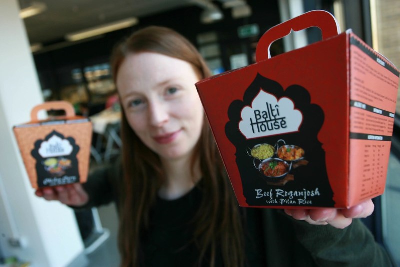
Eilis Buckley – Balti House (Kohinoor)

A shot from the Balti House site of the current store range packaging.

Malwina Ostrowska – Mrs. Doyle’s Tea

Again as a contrast one of the Mrs Doyle range of  products from their site.

Congrats to both of those and to all who took part – I would love to hear from any of the 21 students with more on how they worked with and intepreted the design briefs and the iterations of designs which they went through. Equally thoughts from any of the 8 food producers equally welcomed 🙂

Keith

Guest Post: The story of the Eight Degrees packaging design

A photo from Caroline caught my eye a couple of weeks ago, it was of the packaging for the just launched Eight Degrees craft brewery range:

I liked it a lot and so it gave me the shove I needed to organise my first guest post. And so Erik Johansson kindly wrote the story of the brand for me. This is he

and this is his post.

When the Green Man met Scott & Cam:

I answered the phone one day in August 2010 to soft antipodean voice of Scott Baigent – a Kiwi living in North Cork. He told me about how he and his business partner Cameron Wallace, an Aussie, had received support from the Ballyhoura Enterprise Board to open a microbrewery in Mitchelstown and would I be interested in creating a brand for them? He didn’t have to ask me twice! Branding and Beer – Perfect!

I immediately set to researching the beer market and it took me to the Microbreweries in the guys native Australia and New Zealand as well as the U.S. where the industries are well established and thriving.  During the many student summers I spent in the U.S, the locals would comment on how Ireland had so many great beers. In reality, at the time, you could count all the Irish beers on one hand.

In America however, the brewing industry was thriving and most small towns would have at least one or two local breweries producing some amazing brews; ales, wheat beers, porters, reds and some unusual seasonal brews. My favourite beer was Number Nine – an apricot beer from the Magic Hat brewing Company in Vermont. The memory I have of all of these beers was not only the taste but the strong and individual personality behind each of them. They had something special. You got a sense that the people behind the brewing of the beers were passionate about what they did and did it for the love of it. Passion and determination…
So How does a brand develop from a phone call to a six-pack in the fridge?

It started with the perfect brief. It read something like this:

“The brewery will be called Eight Degrees Brewing Company and will produce a range of 4-5 Ales ranging from a Pale Ale, Amber Ale through to a Porter.  The company name originates from the longitude of Ireland (8 degrees west of Greenwich), but nicely coincides with the ideal temperature to serve our beers. Our catch phrase is ‘Naturally Adventurous’ which nicely pulls together the main values of the business: natural ingredients and different flavours that will appeal to the adventurous in spirit.”

So with images of thirsty mountaineers in mind the creative process began. Doodle, draw, design and more design, Scott and Cam selected their iconic 8 Degrees brandmark that would brandish each of their beers. And then to naming their adverturous beers.

For anyone who has every tried to name anything, you know what I am talking about… The process involved the lot of fun, pots of coffee, home made cookies, and a large canvas of yellow stickies. The finalists survived the age-old rivalry of Aussies v’s New Zealand, with any vague bias to one being swiftly caught and vetoed by the other. In the end it was Howling Gale Ale, Knockmealdown Porter, Sunburnt Irish Red and Pioneer Ginger Beer that made the cut.

Names and brandmark in hand the design of the bottle labels were the perfect platform to show off their unique brand personality. Irishness was important, so the tale of the lads being lured to Ireland, as so many before, by Ireland’s best cailins, was told. Their Aussie/New Zealand sense of fun  came through in their thirst provoking tasting notes. This week we have finalized the six pack carriers – don’t forget to read the underside! And the website is currently in development.

The Result….
Eight Degrees Brewing Co was officially launched at the Franciscan Well Easter Beerfest in Cork City in April this year and the first commercial batch of Howling Gale Ale was very well received. My first sip was not just good…it was great. The taste brought me back to those halcyon summers days of my college years, a welcome antidote to the banality of mass produced beers. Cheers guys!

Erik

Eight Degrees Facebook Page: www.facebook.com/eightdegreesbrewing

The Green Man Studio Website: www.thegreenmanstudio.com

If I can get my ass in gear we will be treated to more of these guest posts 🙂

keith
Artisan Food Packaging – my talk at Foodcamp

This is the talk I gave at the Foodcamp in Dungarvan (part of the Waterford Festival of Food) yesterday.

Thanks to the people who attended for asking questions and making the session interesting – I enjoyed it and hope you did as well.

Keith

Artisan and local food packaging examples No.7

Couple of nice “Before and After” examples here from dieline

Freedom by Yello Brands

became

From the designers: “The identity is a daisy chain illustration of their process and the care they take in growing and handling ingredients to delivering great quality with the benefits of eating and feeling better.”

A great example of a product which in its previous version you would classify as a medicine – don’t purchase unless you have to – moving to a cheerful and desirable product catering for a specific consumer niche.

via Dieline

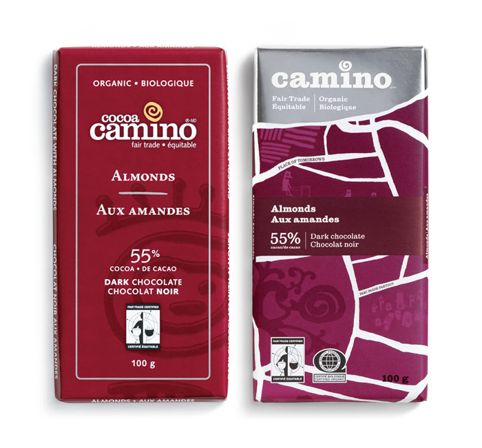
Camino by Karacters, illustrations by Chris Haughton

From the designers: “the brand idea “a joyful food revolution” captures Camino’s belief that through the joy of eating great tasting food made from quality ingredients, people will be encouraged to think differently about their food – where it came from, who made it and what’s in it.”

This idea of celebration and joyfulness comes up a lot in my work with artisan brands – connecting people with the food they eat in a way which compromises neither taste nor the process which produces the brand.

via dieline

Keith

Artisan and local food packaging examples No.6

For me a food brand is nothing without the people behind it and this batch of packaging designs picks up on that theme as a way of connecting their brands with consumers on the shelf edge.

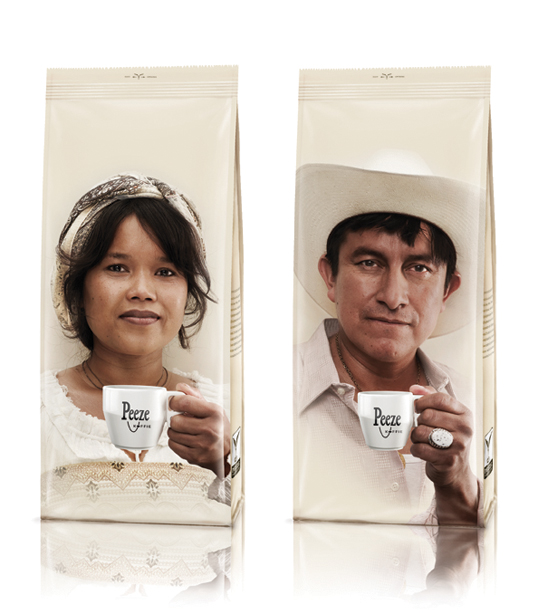
Peeze by SoGood

I have seen this regularly from smaller coffee brands – especially those who work with Fairtrade systems. Very interesting comment on the blog post this came from: “this is ridiculous. designed for a bunch of white people on the netherlands so they can see the “many colors” of the developing world without feeling bad about how people get exploited. commodification at its best.”

Fair point – a quick glance at their website and they do not appear to use any of the mainstream Fairtrade certification although they could still have strong and supportive relationships with their suppliers.

Nice packaging one way or another!

via Lovely Package

Sigtuna by Morkman


Putting it out there – this is superb. A micro brewery close to Stockholm where the Chief Brewer Mattias is not afraid to get up close and personal with his customers. For any and all Irish artisan and local food brands – be bold. This IS about you and don’t be afraid to show it 🙂

[note – the brewery concerned do not appear to have a website – this is a good interview with Mattias]

via Lovely Packaging

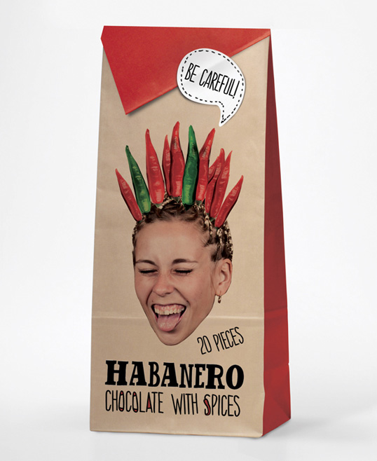
Sweet and Hot by Ivanna Shashkina

Part of the fun of Lovely Packaging is that they feature student design work regularly. This one is really effective and shows how humour could be integrated with the people theme.

via Lovely Packaging

Eno by LPW Studios

Nice blend of people and a retro feeling to give these wines a strong visual identity on the shelf. Both the winery owner and the designer have contributed in the comments – here is part of what Sasha from the winery said: “Some context- each year we change the label design (but keep the same typographic treatment of the logo, wine detail, etc). This particular year, 2004, was “a family archetypes”. Hence the names and the pictures of family members.”

This is important – the people concerned are real people and this brings this design execution beyond the realms of just another whim/concept dreamed up by the designer. For artisan food brands that authenticity is so important – and so easy.

via Lovely Packaging

If you liked this check out other packaging posts in this series here.

Keith


The Organic Herb Co – new brands and on special offer

My first post on this brand was on the 5th November following a great conversation and tasting with them during Savour Kilkenny. Since then I have been lucky enough to start doing some work with them on a web project and I am really enjoying their approach to and passion for the business.

One of the things they shared with me recently was a new version of their labelling – which is already ultra-sharp.

As you can see (and I will try to do a fuller post with their input to do this justice) the new labels which you can see 3 of here encompass:

  • A shortening of the lead brand name to OHCo – this allows it to work across multiple languages
  • Colour differentiation of flavours
  • Stripes to lift and sharpen the impact on the shelf

And on the subject of the special offer the Organic Supermarket are running a 20% off offer on some of their products right now:

Click on the images above to be brought to the relevant pages on the Organic Supermarket site. An opportunity to try one of these for the first time and see just how delicious they are (I have the Irish Garden Herb oil and it is superb).

Keith


Natasha’s Raw Chocolates

I have written about this brand before but not since October. In the meantime I was given a box of their chocolates (Raw which means processed at a temperature of under 42degrees C) for Valentines Day. Really impressed by the detail of the packaging – doing justice to the amazing taste of the chocolates. This is so much work to get to this level – well done.

The box is heavy card and wrapped in this bow.

Inside the card there is the classic product information and on the back of that a lot more information on Natasha’s and the raw chocolate process

And then the chocolates, my favorite was the Nutter.

Check out their website here.

Keith

Artisan and local food packaging examples No.5

Braufactum by Flaechenbrand

This is a superb example of upmarket positioning by this craft brewery which was set up in Germany in August 2010. Take a look at the full post – the detail of every aspect of the bottles and labels is worth a couple of minutes of your time.

via TheDieLine

Brooklyn Gin by Spring Design Partners

Ok – more detail, hmmm. Looks like my post has a very premium positioning theme. And allowing myself a quick mention of their website as well:

That shot and description on their homepage is very evocative and oozes authenticity – the source and production backstory is one every artisan website should get into your face immediately.

Back to the design – “The bottle structure pays homage to the apothecary origins of gin, reinforcing its place in the new speakeasy, while the medallion label – stamped in metal – celebrates the authentic spirit at the core of the brand”. Always important to be clear on what is to be achieved with each aspect of a brand from website to labelling.

via TheDieLine

Love both of these – this is packaging which is expensive however there are lessons to be extracted for every brand.

Keith

Artisan and local food packaging examples No.4

Another visit to the world of interesting and innovative packaging for artisan and local food brands.

“by Hoogesteger” by Design Bridge

Not entirely clear if this is a local brand or a much larger one – however this packaging is really effective. Such a simple use of strong and large scale cutouts together with minimal text.

via TheDieline

Velo

Cannot find the designers of this one – have asked them for the name. No debate here on their artisan status. “Velo” is French for “bicycle”, and that’s our principal method for delivering hand-roasted beans. We believe all businesses should operate with low-impact techniques, from start to finish.

You can only get away with this kind of packaging if you mean it. However this brand wears its core message upfront with no confusion.

via TheDieLine

The Food Doctor by Pearlfisher

The marketing machine that is Ian Marber recently changed its food product packaging to the above. The design agency give a good background to the approach in the post this is from, incorporating the strong shape, colours and text content.

The discussion in the comments that follow adds to the post nicely – debating the focus on a single apple shape and also wondering if the health benefits are conveyed sufficiently by this re-brand.

via LovelyPackage

Another one in this series coming up later in the week – check out the Packaging category to the right for more of these.

Keith

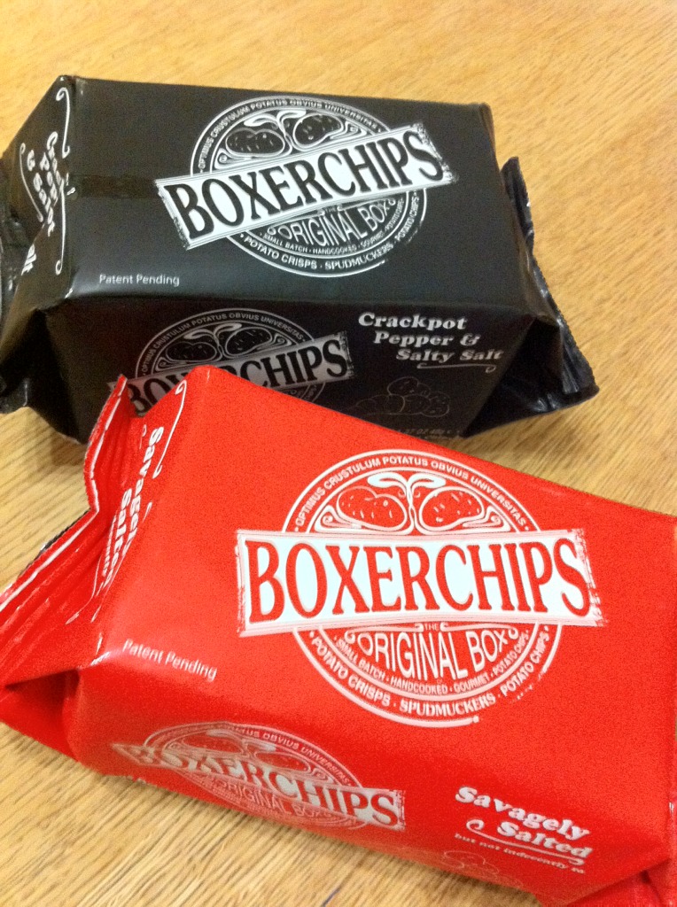
Boxer Chips by Irish spudmuckers

While at an event in Dublin during the week I was handed a couple of packets of these to try – cheers Mr Mulley.

This (for me) is a superb brand approach that works really well. Based in Sandyford and trading as Spudmuckers (you would wouldn’t you) they have borrowed from the approach that is most associated with Innocent. This combines great food with humour and a slight irreverence. Their website is here, its Flash based but actually makes relevant use of that.

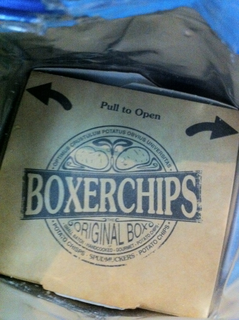
Opening the outer layer you see a cardboard inner:

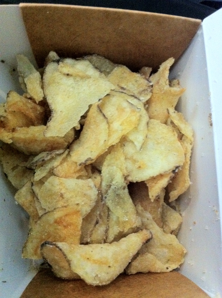
Think of a takeaway box. Within that are the batch cooked crisps:

Yep – they taste as good as they look and were enjoyed by all in the household.

A lingering doubt cropped up for me as I worked through those layers of packaging – wasn’t this just wasteful and an example of kopping out to some fancy design concept?

Not according to their website which says: “our carbon footprint is tiny due to the space efficiency of our innovative and recyclable packaging”. I am not a carbon footprint expert so over to someone who is. Not entirely sure of my ground on this but still have residual concerns.

Apart from that congrats on the product and brand guys and girls. Follow them on twitter, no Facebook presence that I can see.

Keith